Tim Feuring
A range of digital design projects, including UX/UI design, accessibility, digital illustration and more.
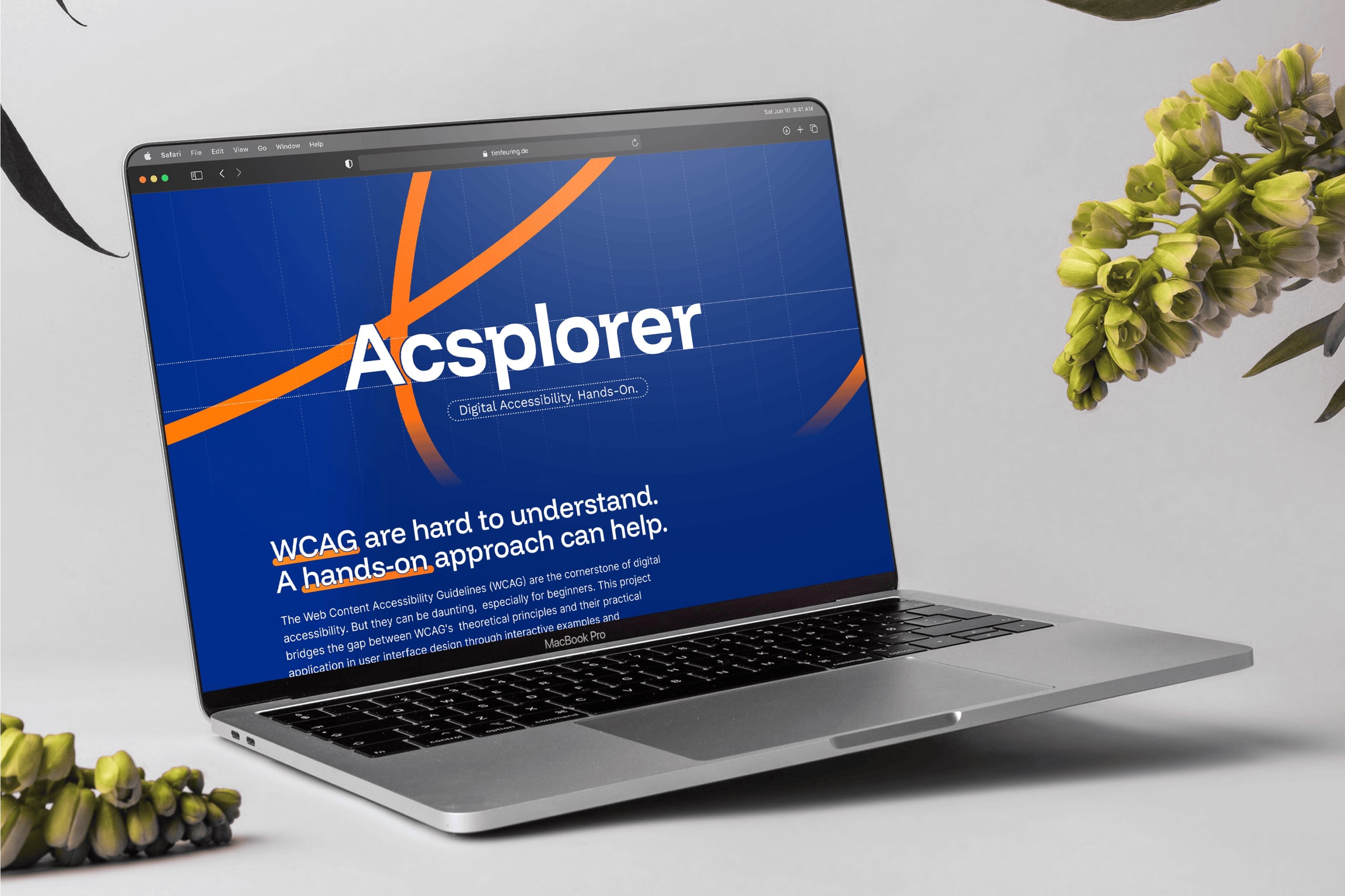
Digital accessibility is more important than ever, but it’s hard to understand. For my bachelor-thesis, I created a concept and application that communicates accessibility principles in an easy-to-understand approach.
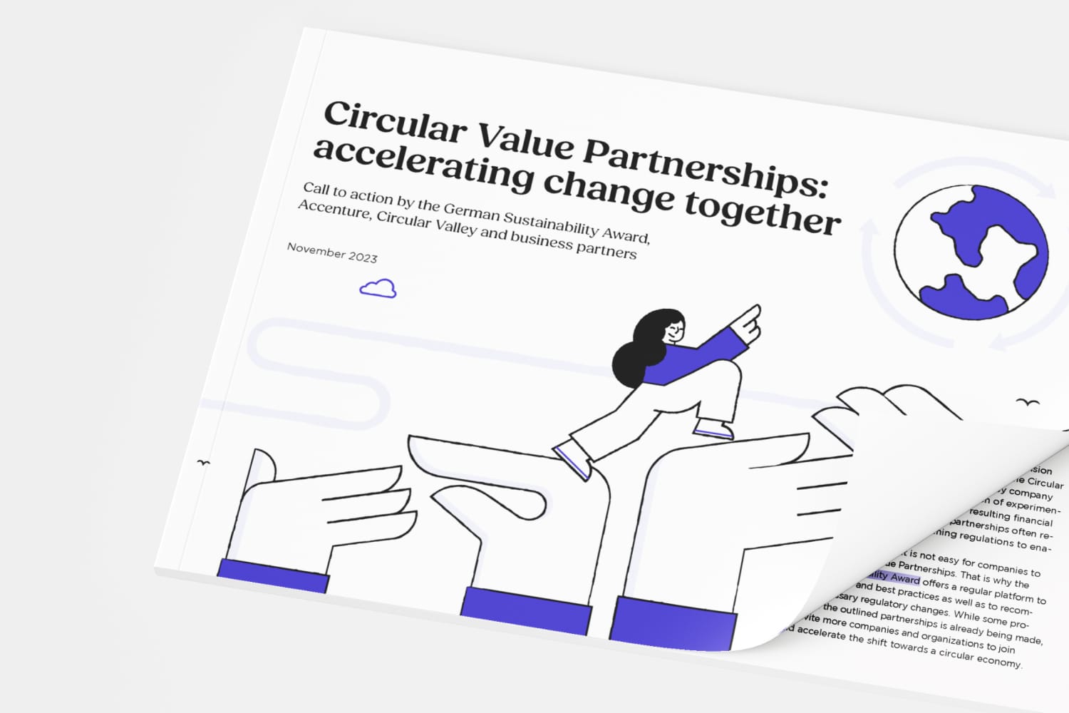
I designed and illustrated the whitepaper „Circular Value Partnerships: Accelerating Change Together“, a collaborative whitepaper by Accenture, Circular Valley and the German Sustainability Award. The publication aims to accelerate the shift toward a circular economy in Germany. Through clear layout, infographics, and visual storytelling, the paper highlights how cross-sector collaboration can drive sustainable transformation.
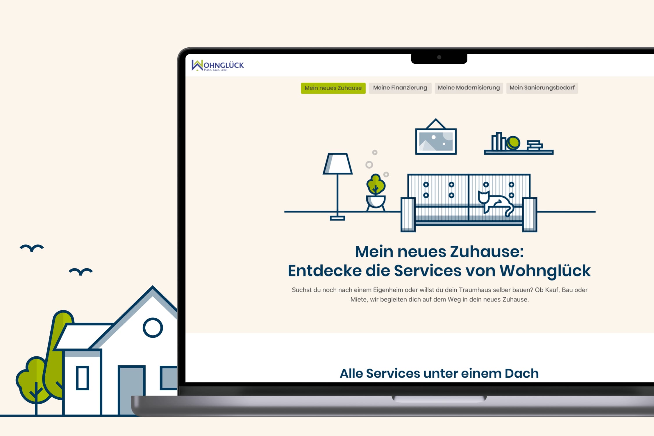
I developed a cohesive illustration style and helped to bring the visual and functional experience of Wohnglück.de to the next level.
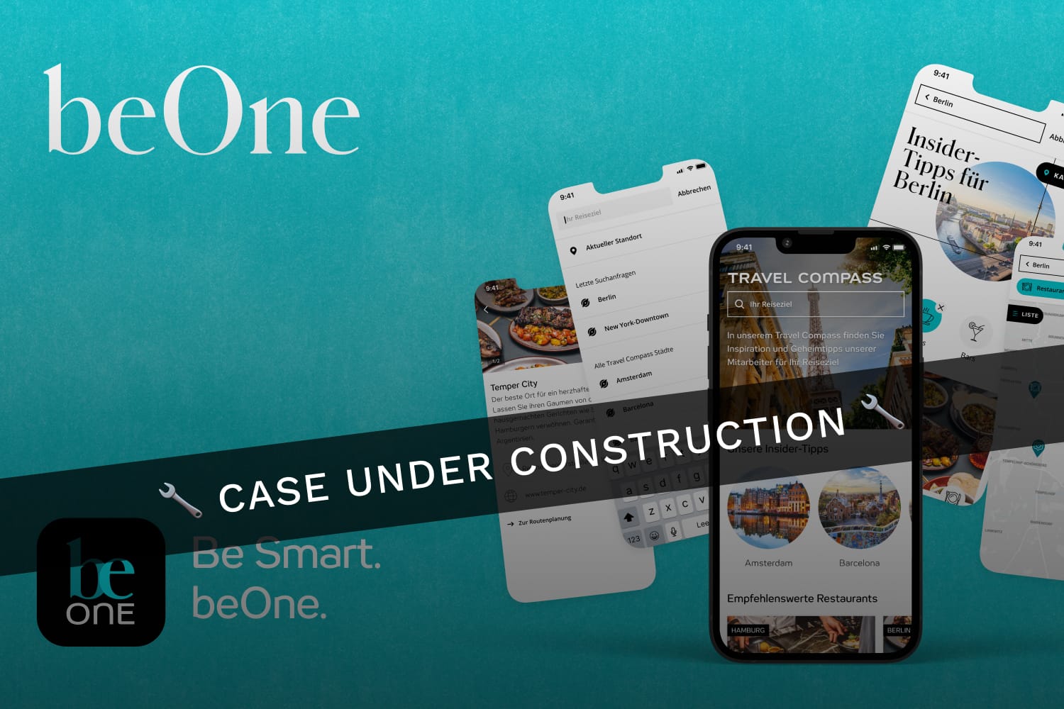
Over the course of 2.5+ years, I contributed to the continuous development of the beOne App, Motel One’s digital travel companion. My work included the development of new features and user flows, as well as the strategic management of cross-platform design libraries for iOS and Android in close collaboration with product teams and clients.
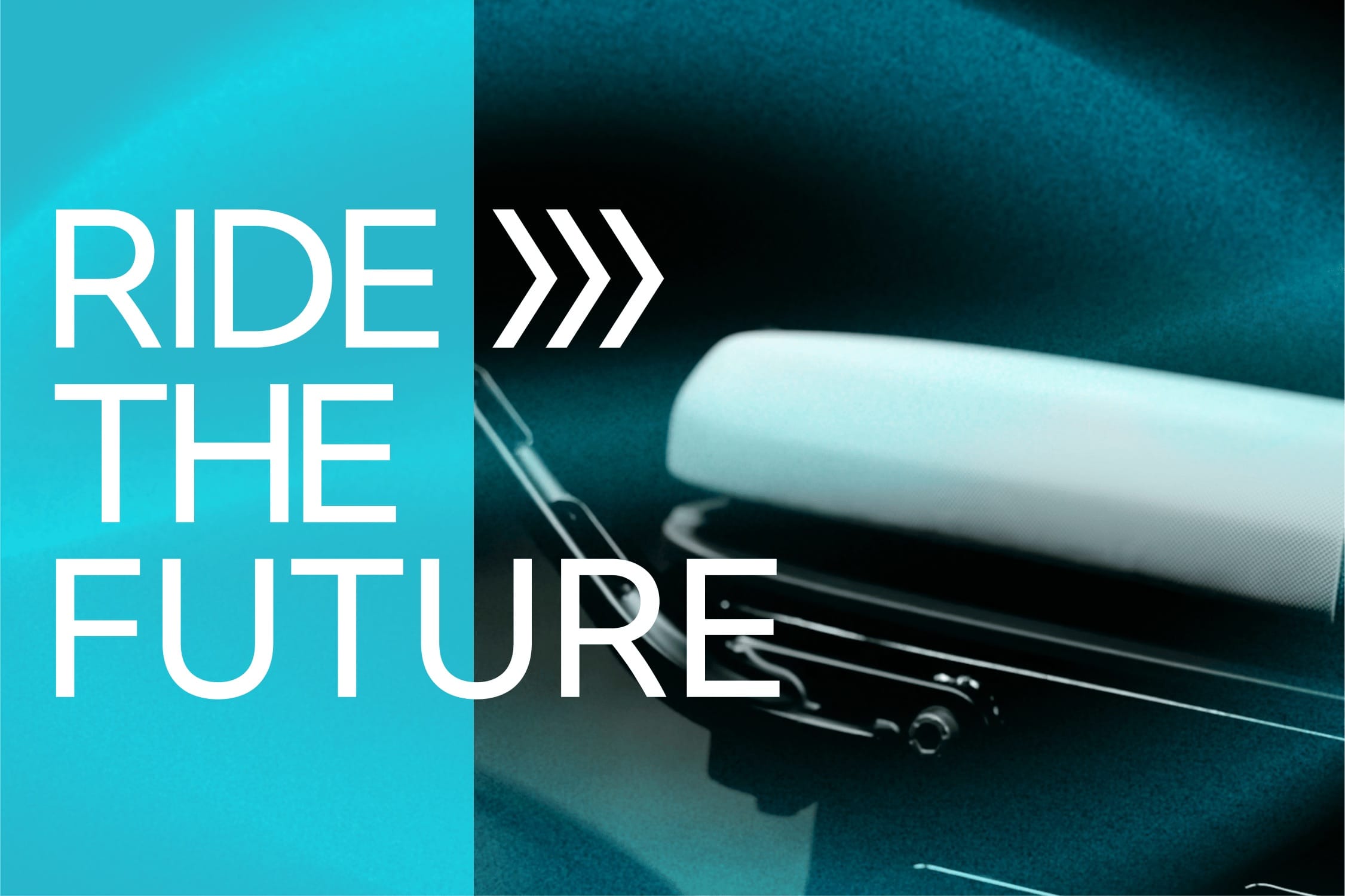
A redesigned communication proposal for BMW Motorrads all-electric CE02 parkourer, focussing on clear storytelling, simple layouts, and a visual language that speaks to a younger urban audience.
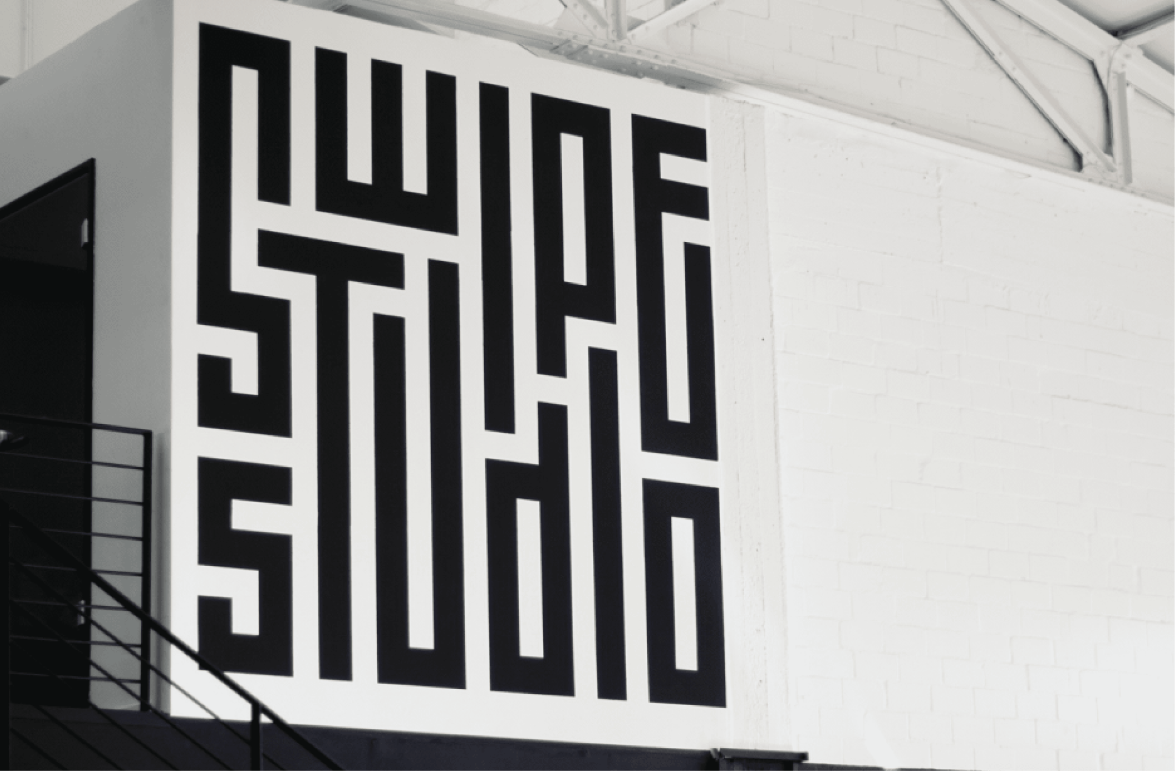
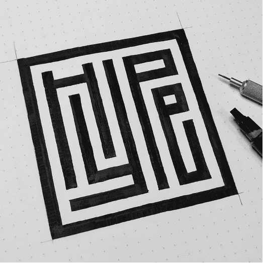
A mazing logo design among other visuals created for different occasions. Over the years, I’ve created various visuals for Swipe Studio, ranging from social media graphics to event assets. Among them is a characteristic logo design that captures the studio’s energy in a clear, typographic approach.
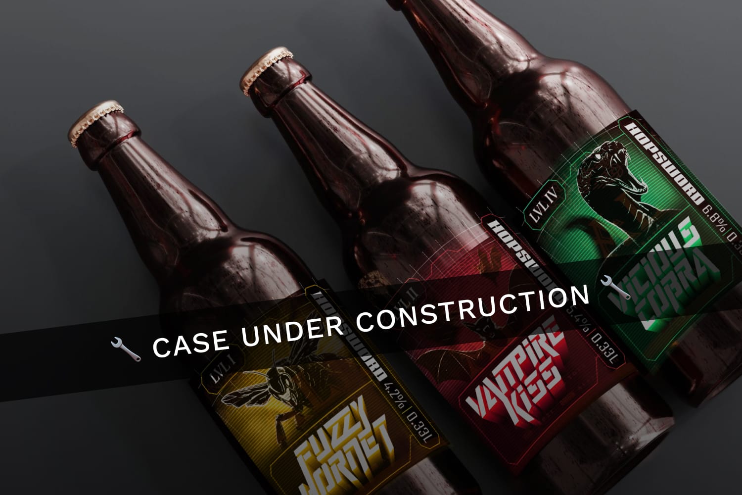
Concept for a craft beer brand that stands out through its adventurous character. From logo and label design to special edition packaging concept, the visual identity captures the spirit of exploration in taste and in tone. Explore an adventurous voyage of taste!
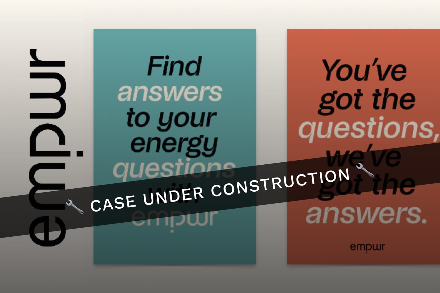
A visual identity for a fictional energy service brand that focuses on clarity and approachability. The idea: simplifying complex topics—like green energy, consumption, and pricing, making it more understandable and relatable for everyday users.
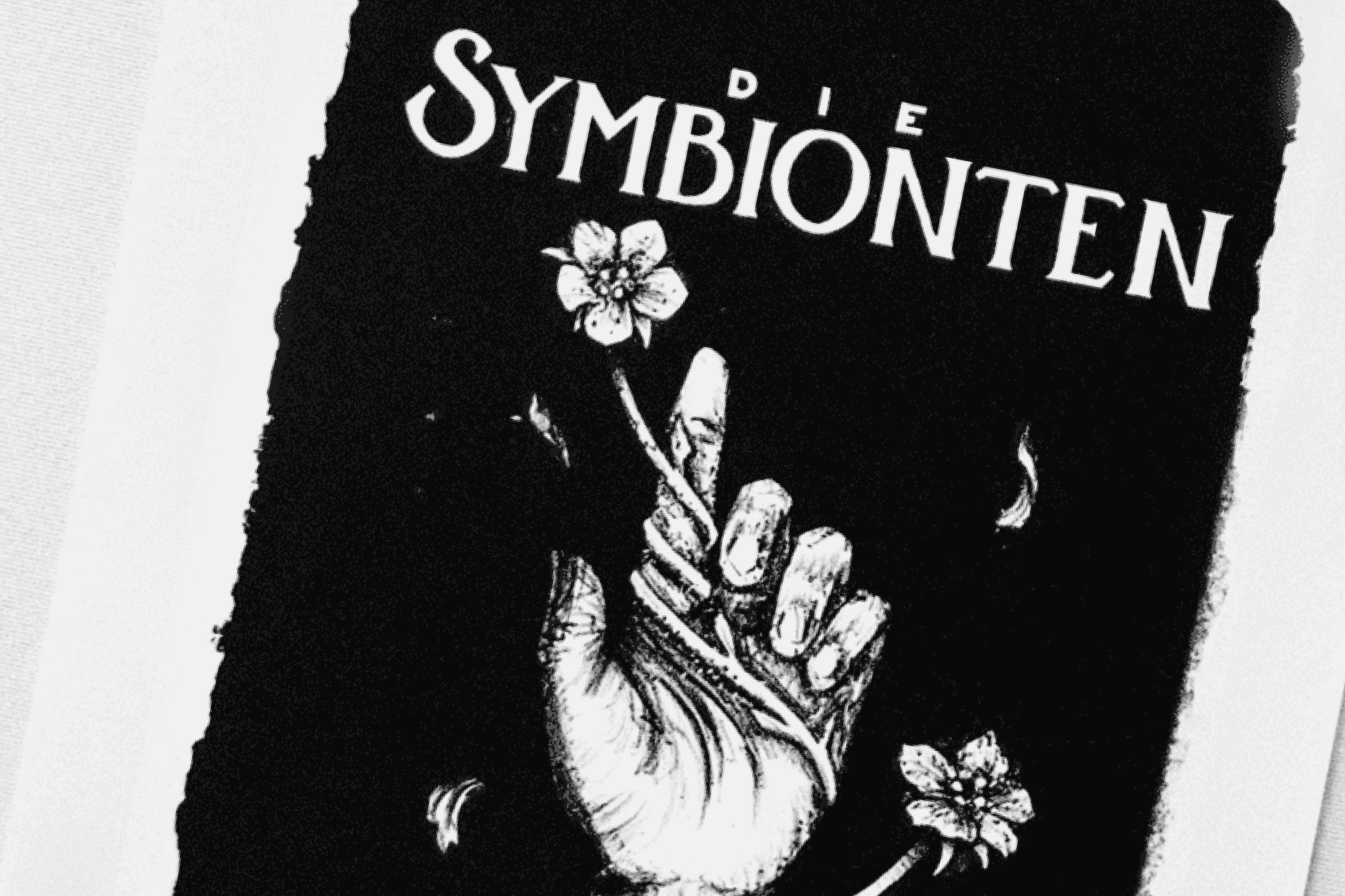
A series of pen-and-ink lithographs, developed and printed in a traditional workshop in Tidaholm, Sweden. Each motif was hand-drawn on stone and printed using the flat printing technique lithography – blending detailed illustration with a nice texture and depth you can only achieve with analog techniques
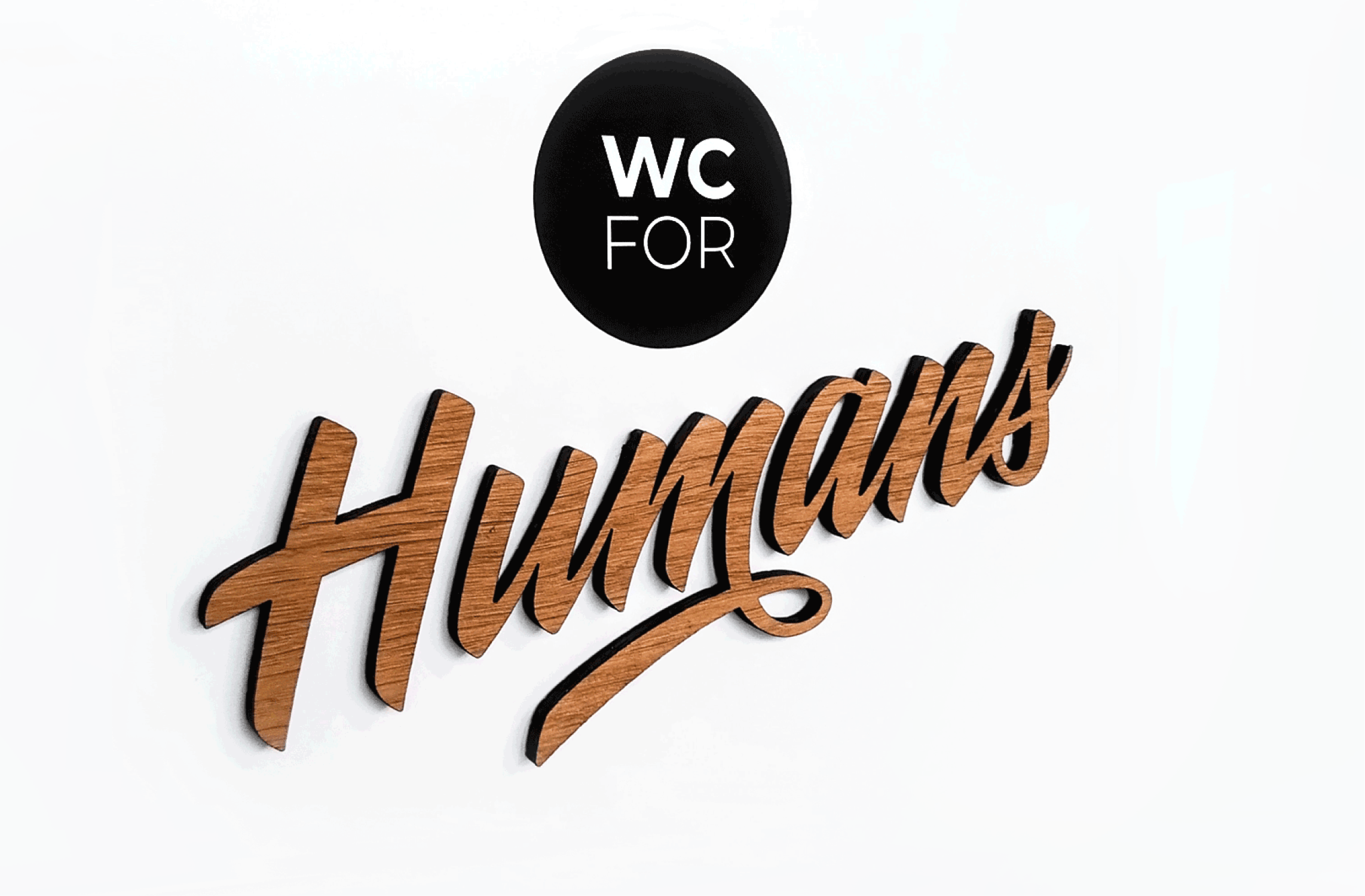
For a local café, I designed and hand-crafted inclusive, gender-neutral restroom signage. The custom lettering and illustrations were created with care to reflect the café’s welcoming atmosphere and commitment to diversity, resulting in a thoughtful visual statement that combines warmth, clarity, and inclusivity.
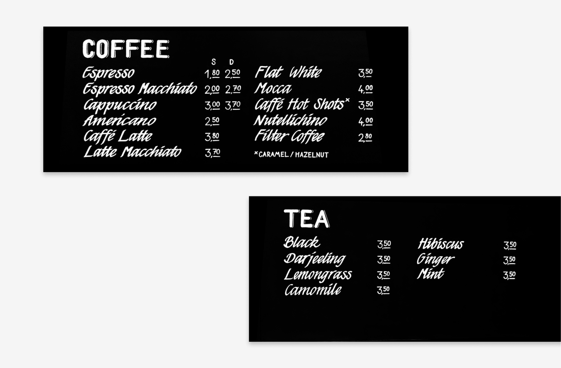
A set of hand-lettered blackboard signs, designed using chalk markers. The goal was to create something warm and inviting that fits the café’s vibe. With a mix script and bold lettering, the signs add a personal, handcrafted touch to the space.