WC for Humans
Production
Installation
For a local café, I designed and hand-crafted inclusive, gender-neutral restroom signage. The custom lettering and illustrations were created with care to reflect the café’s welcoming atmosphere and commitment to diversity, resulting in a thoughtful visual statement that combines warmth, clarity, and inclusivity.
Time to be more equal
Equality starts somewhere in our day to day life – and sometimes, it can be small things that make life a tiny bit easier and better for everyone. Finding a restroom in a public place is often more complicated than necessary. Everyone knows how annoying long waiting times at social events are, and often, the surroundings are very beneficial to mens needs. And as if that alone would’t be enough trouble already, the common men / women approach to labeling restrooms can leave non-binary people feel unseen and mistreated. So maybe, instead of labeling too much, a good approach could be to focus on what truly unites us all – we are human beings with dignity and deserve to have equal possibilities. Even if it’s just the fact that we could all go to the toilet in peace. I think making public toilets accessible for everyone might be a small step into the right direction.
With that being said, I was very happy to create this sign-concept for the café Dreamy Donuts in Hamburg. The goal was to find a matching approach to the look of the interiors, stand out visually, and just be joyful to see – a perfect call for a unique, handmade sign.
The first things to sort out were possible materials and techniques that would help to transport the desired look and feel and to match the interiors of the café. The surroundings create a welcoming atmosphere with stable, wooden furniture and warm lighting, plants let the rooms come alive, and everything is flooded with daylight. The signs should blend into that atmosphere and be lively and characteristic on their own. So instead of having common plastic letters, the sign should have nice haptics and stand out – literally.
My approach to achieve that look was to use wood as the basic material. This idea came up naturally, as it fits the wooden interior just right. And fortunately, there’s a good way to produce very precise cutouts from wood – by using a lasercutter!
But before cutting, the visual concepts needs to be worked out. So after researching for a while and gathering ideas, I started with first sketches to define possible letterforms.
 First style exploration with playful, ornamental letterforms
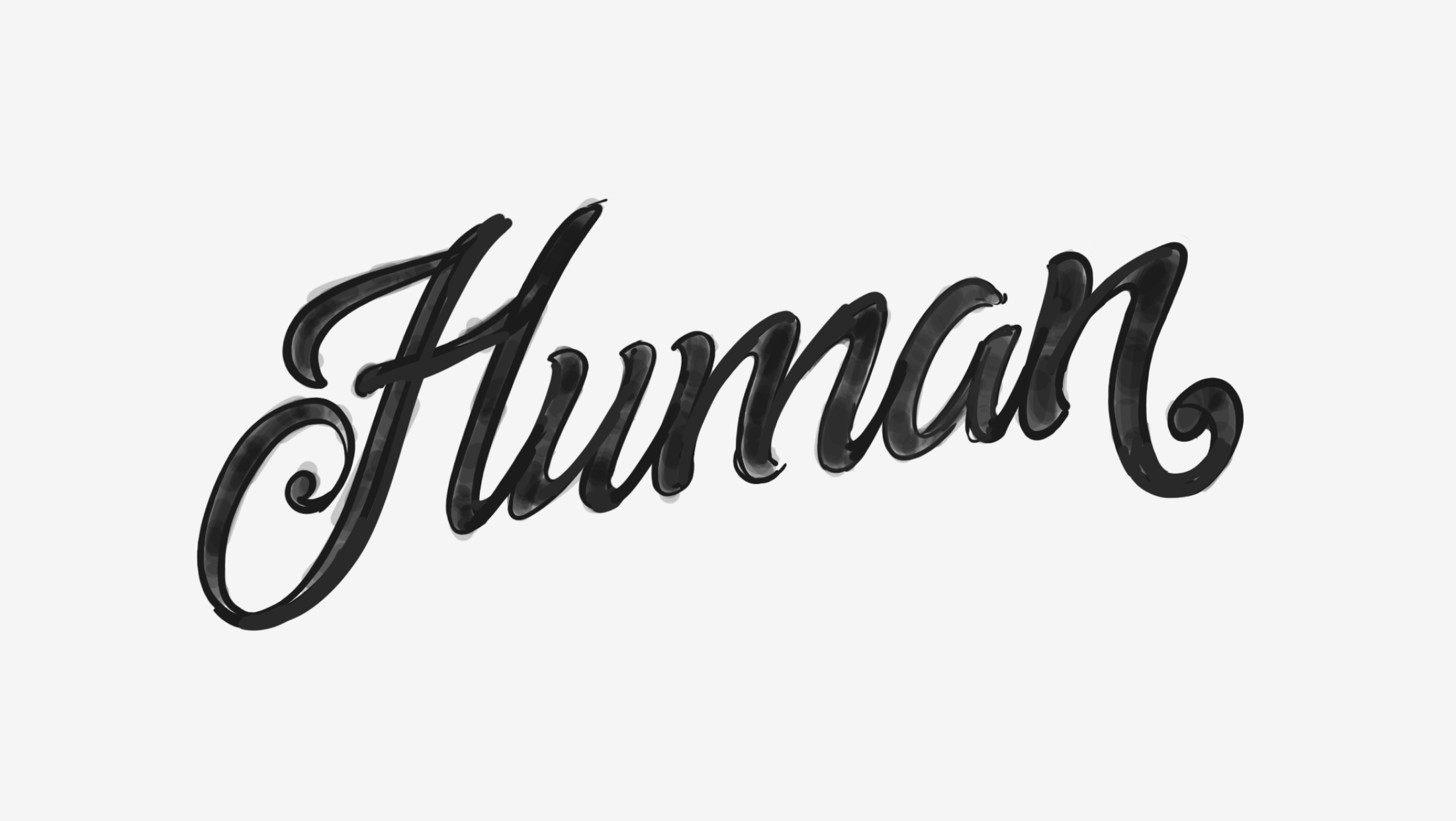
The first exploration led to a playful, kind of ornamental shape form of letters. While the shapes fit well together and build a harmonic unit, they seemed a bit too complex. The small details would possibly have caused trouble in the production and the thin strokes would be very fragile. Also, the style of letters might have been too classic, an attribute that would not have fit the modern character of the café so well.
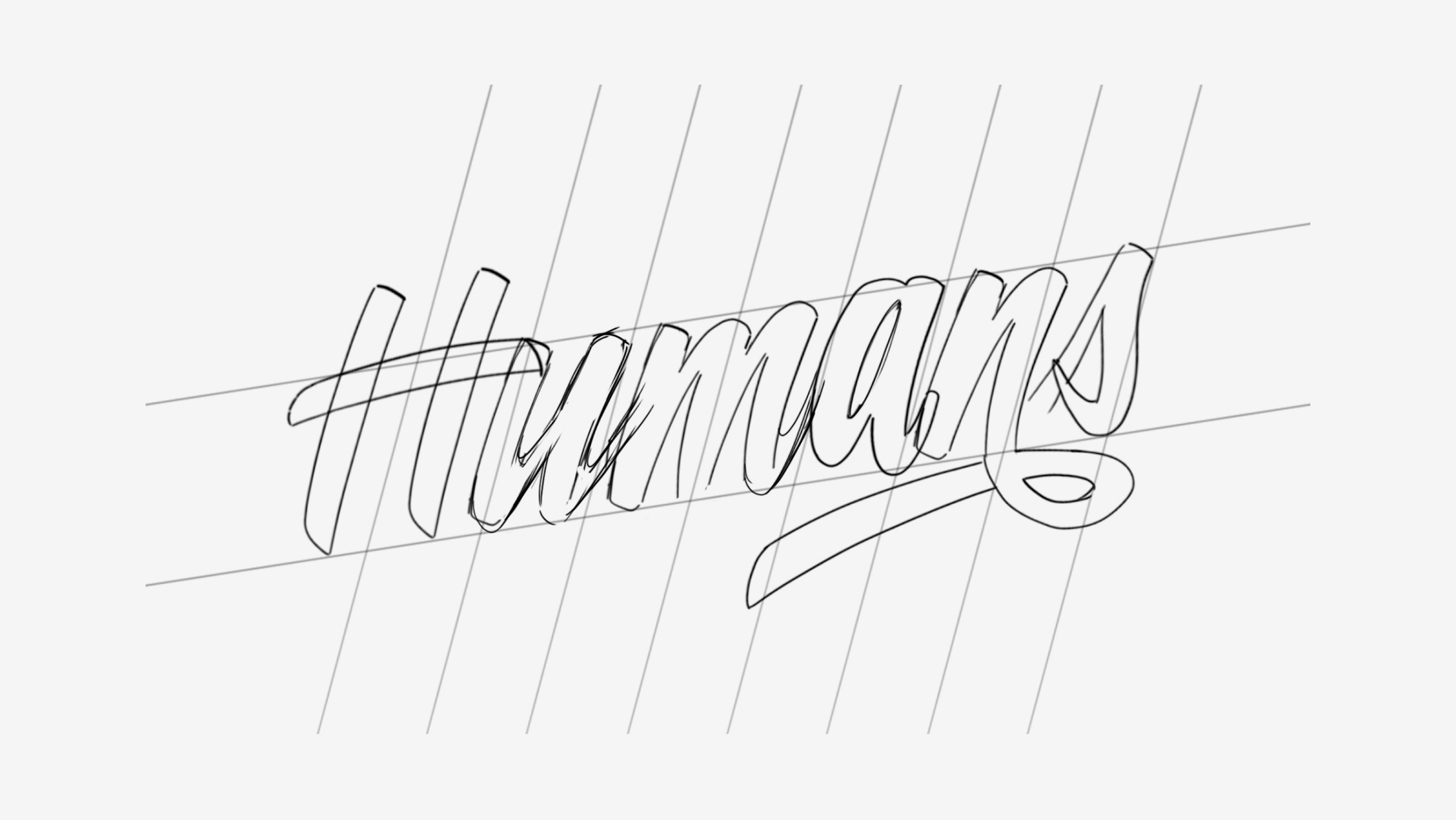
So for the next approach, I chose to go for bolder, clearer shapes. Also, the interconnections of letters should be stronger and more resistant in case the signs would be touched or moved.
 Second approach with bolder, clearer letterforms
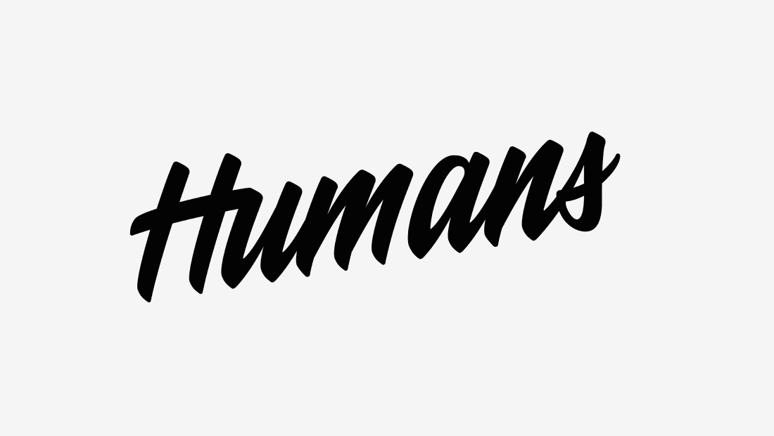
Bolder letterforms, stronger interconnections and less tiny details led to a clearer, more modern look. The overall style fit the desired character way better and seemed to be functioning just right.
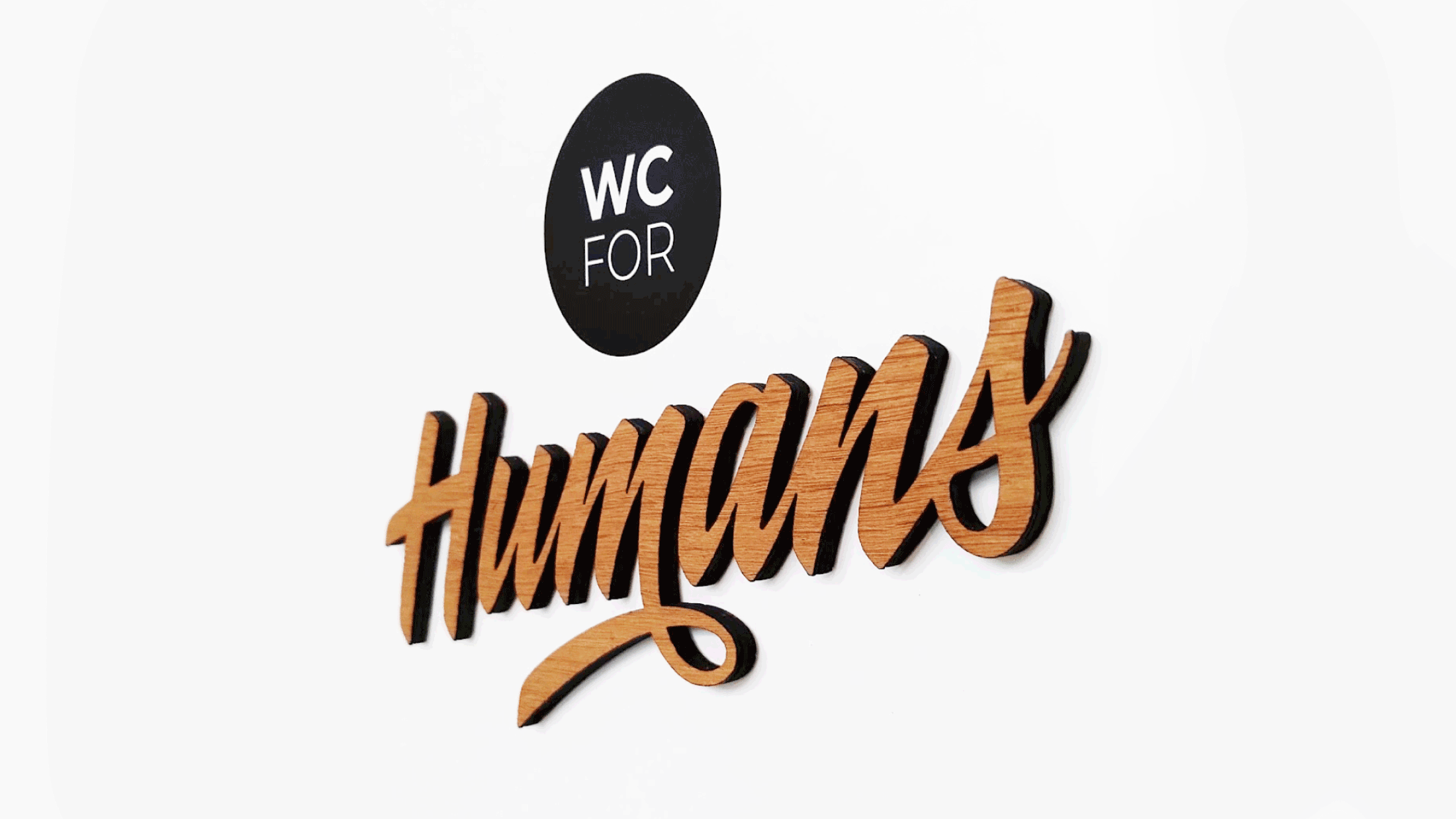
As the word Humans on it’s own would not be too obvious and still leave much room for interpretation, there needed to be another clear indicator to clarify that these are restrooms. To create a contrast to the wooden sign and to let it be the main eye catcher, I decided to go for a flat, minimalist approach in form of a sticker. While another part made of wooden letters would have been too small-detailed to cut precisely and would compete with the main word Humans, the sticker would not steal the attention and complement the wooden letters instead.
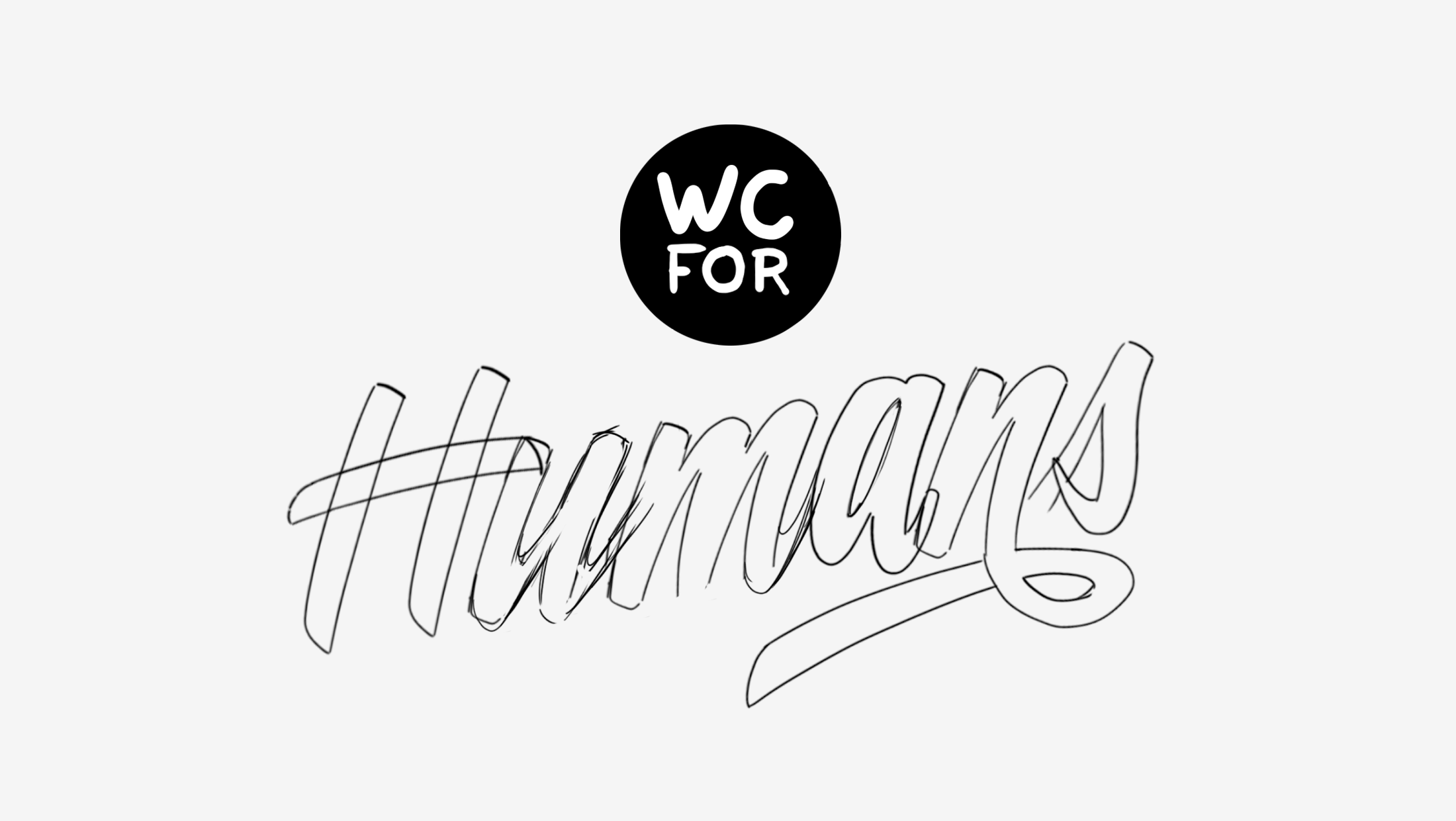 Adding complementary indicator for the restrooms
Now that the basic concept for the sign is fitting and works fine, it’s time to work out the details and vectorize the artwork. For the production of the sign, a clean and precise layout is needed.
 Vectorizing the lettering and making adjustments in the process
In the vectorization process, the design is tweaked until it fits just right. In this example, you can see how the spacing and the details of the individual letterforms are adjusted. Also, the size and spacing for the matching sticker need to be defined.
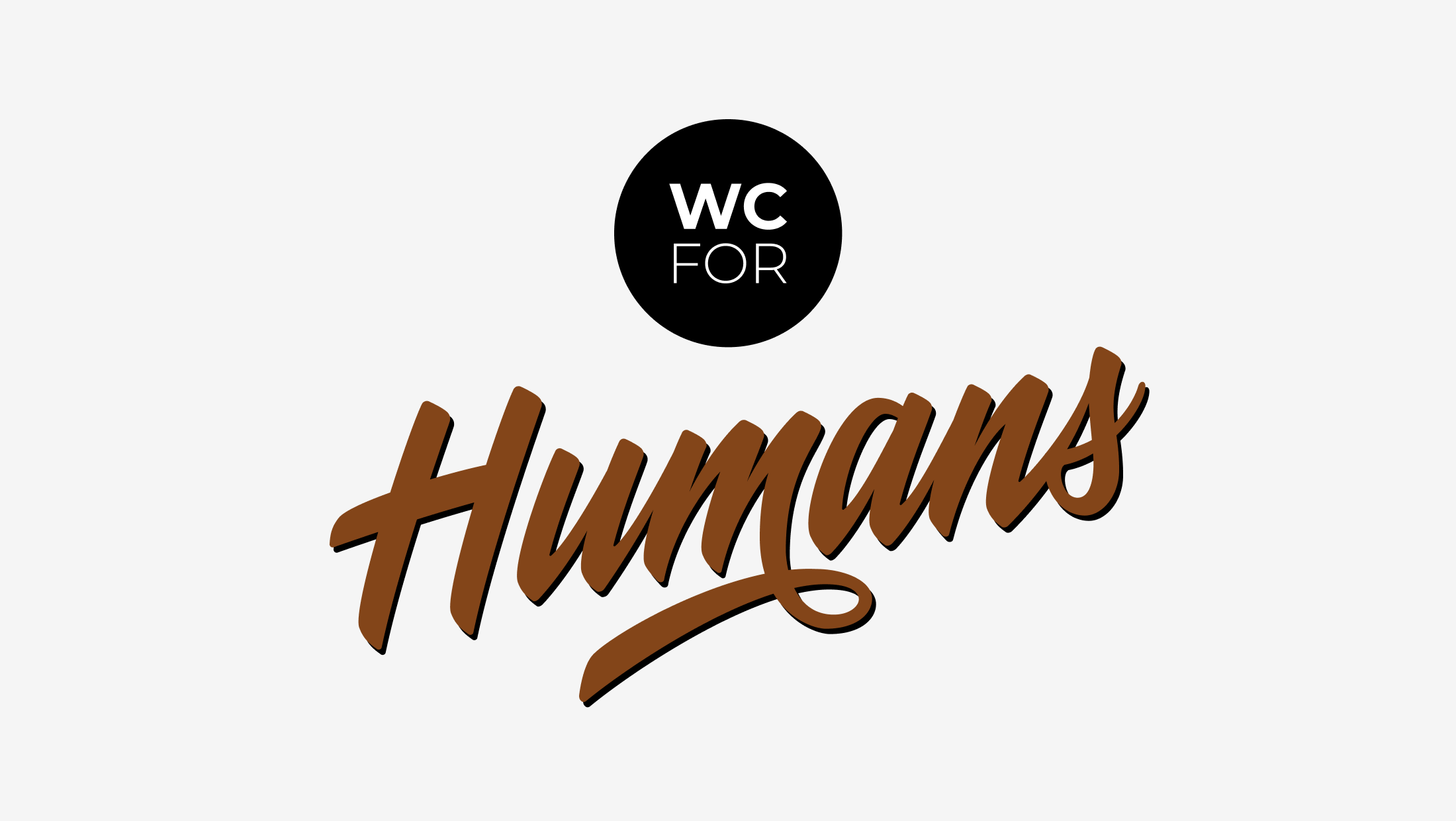 Final lettering and sticker design ready for production
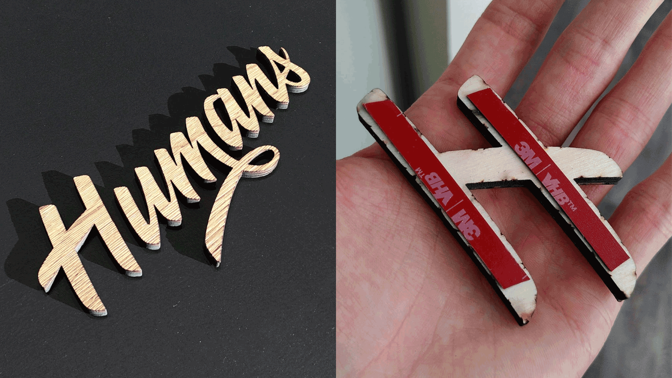
Now that the design is finished, it’s time for production. The letters are cut out of solid wooden board with the help of a lasercutter (for this, I worked together with lasercut.hamburg) and the stickers are plotted.
 Lasercut wooden letters with tape on the back side
The cut wooden letters have a nice texture that make the sign even more haptic and interesting to look at. On the back side, you see the tape to stick the letters to the door.
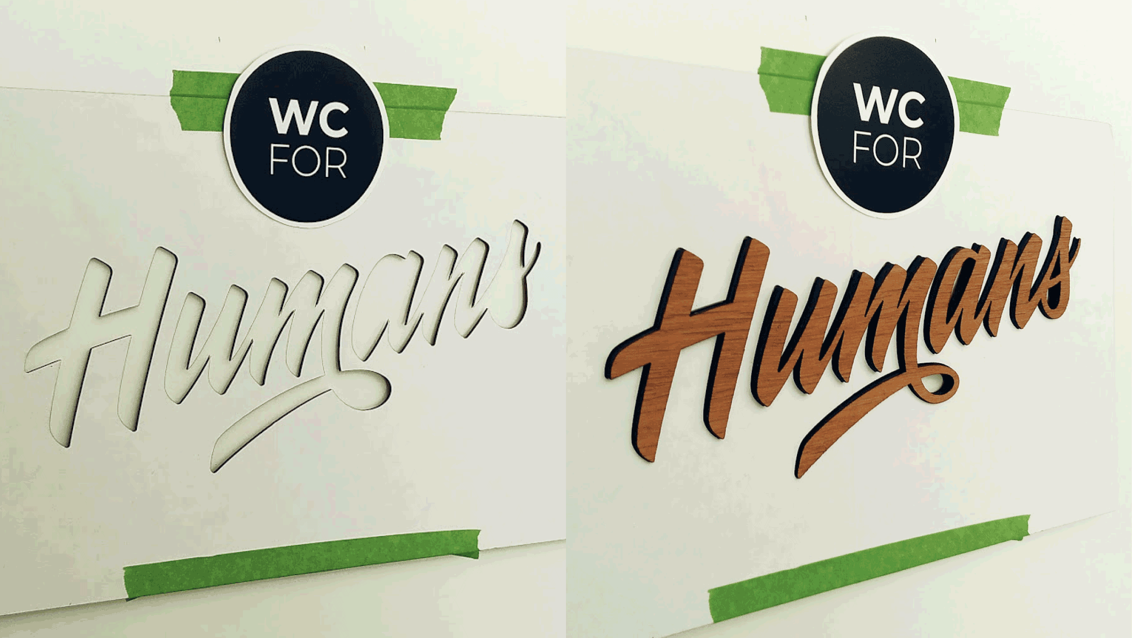 Positioning the sign on the door by using a stencil
Now it’s time to place the sign! Using the stencil, the position can be adjusted until it’s just right. When the position is found, the only thing that’s left is to glue it to the surface.
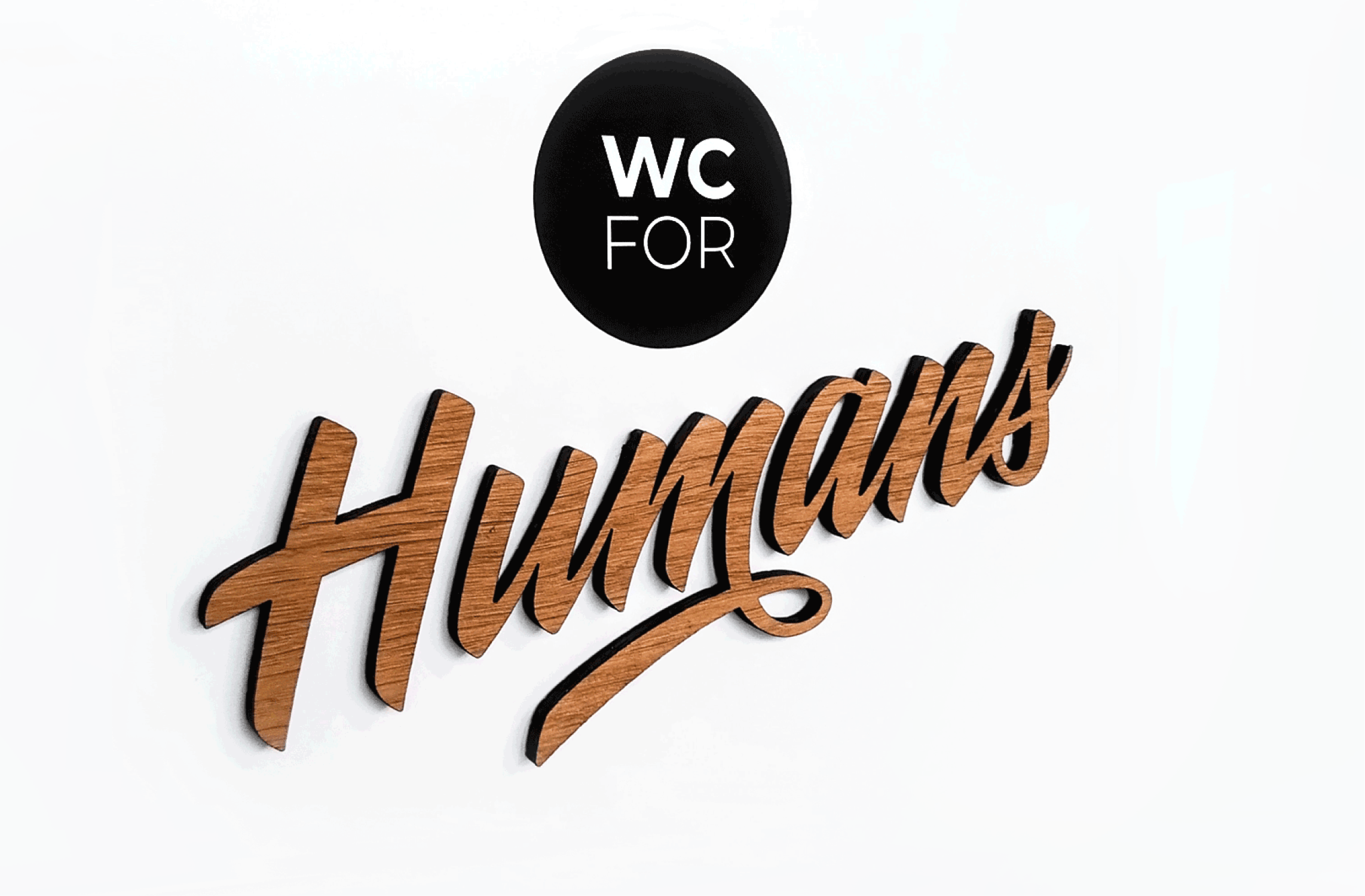
 The finished sign hanging on the door
Et voilà – everything is finished and installed. Now we have a beautiful, unique sign to welcome everyone to the restrooms. When there’s so much love to the detail even for the toilet signs, imagine how good the food will taste!
Thanks for reading! 😊