Wohnglück.de – Visual Language & UI
I developed a cohesive illustration style and helped to bring the visual and functional experience of Wohnglück.de to the next level.
Visual Rebrush
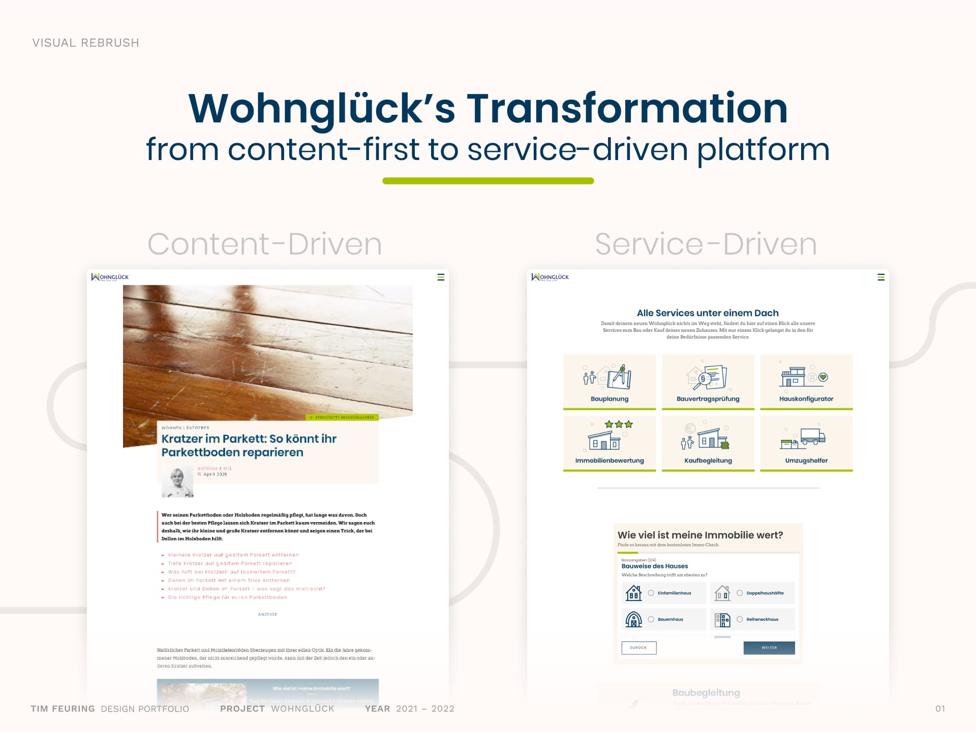
Wohnglück.de was shifting from a broad, content-heavy offering towards a more focused, service-driven platform. To support this transformation, the historically grown visual system needed a refresh, become more strategic, engaging, and reflective of the platform’s growing user-centered services.
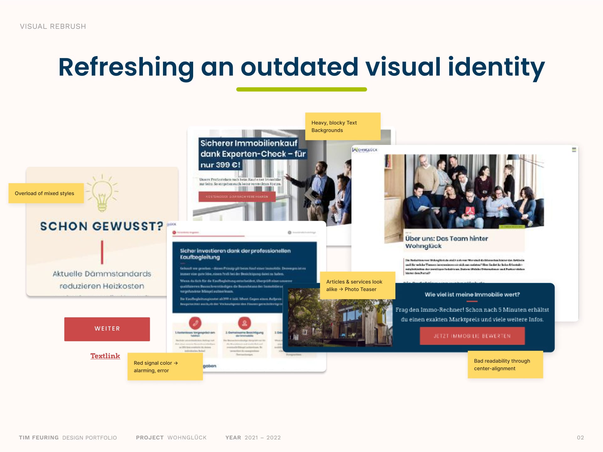
Wohnglück’s visual system had grown a bit outdated over time, showing inconsistencies in style and general design debt. The interfaces visual clarity, hierarchy, and polish were diluted, resulting in a blocky, uninviting look that didn’t reflect Wohnglück’s focus on user-oriented services. Apart from article photos, the platform offered little visual engagement, making a visual update necessary.
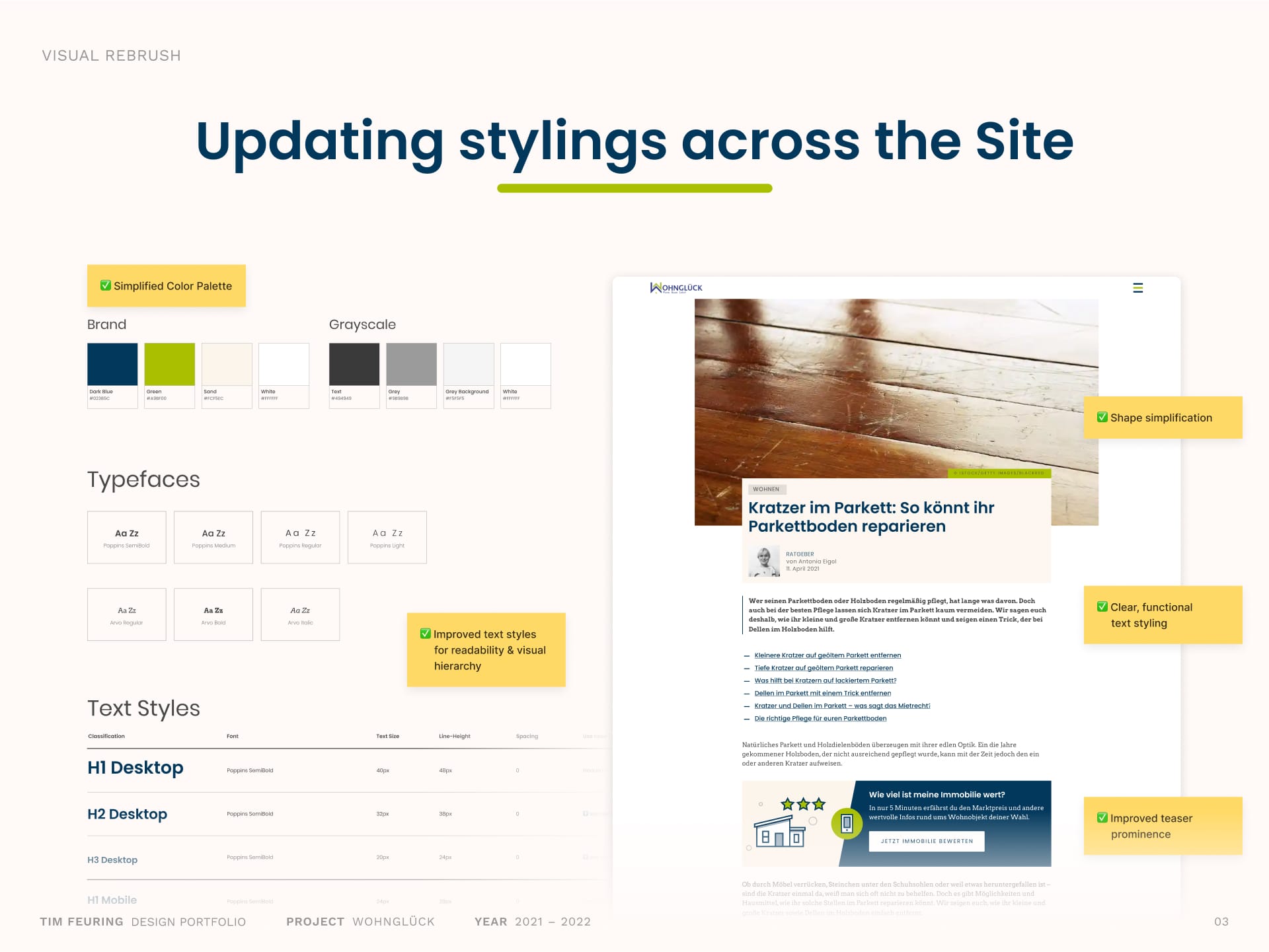
I updated the core styles by refining colors, typography, shape elements, and more styles across the interface. The sharp, red accent color was replaced, resulting in an overall calmer, more inviting look and feel. Typographic adjustments like consistent letter spacing and better use of font weights helped to establish clearer visual hierarchies and better readability.
Iconography and Illustration Style
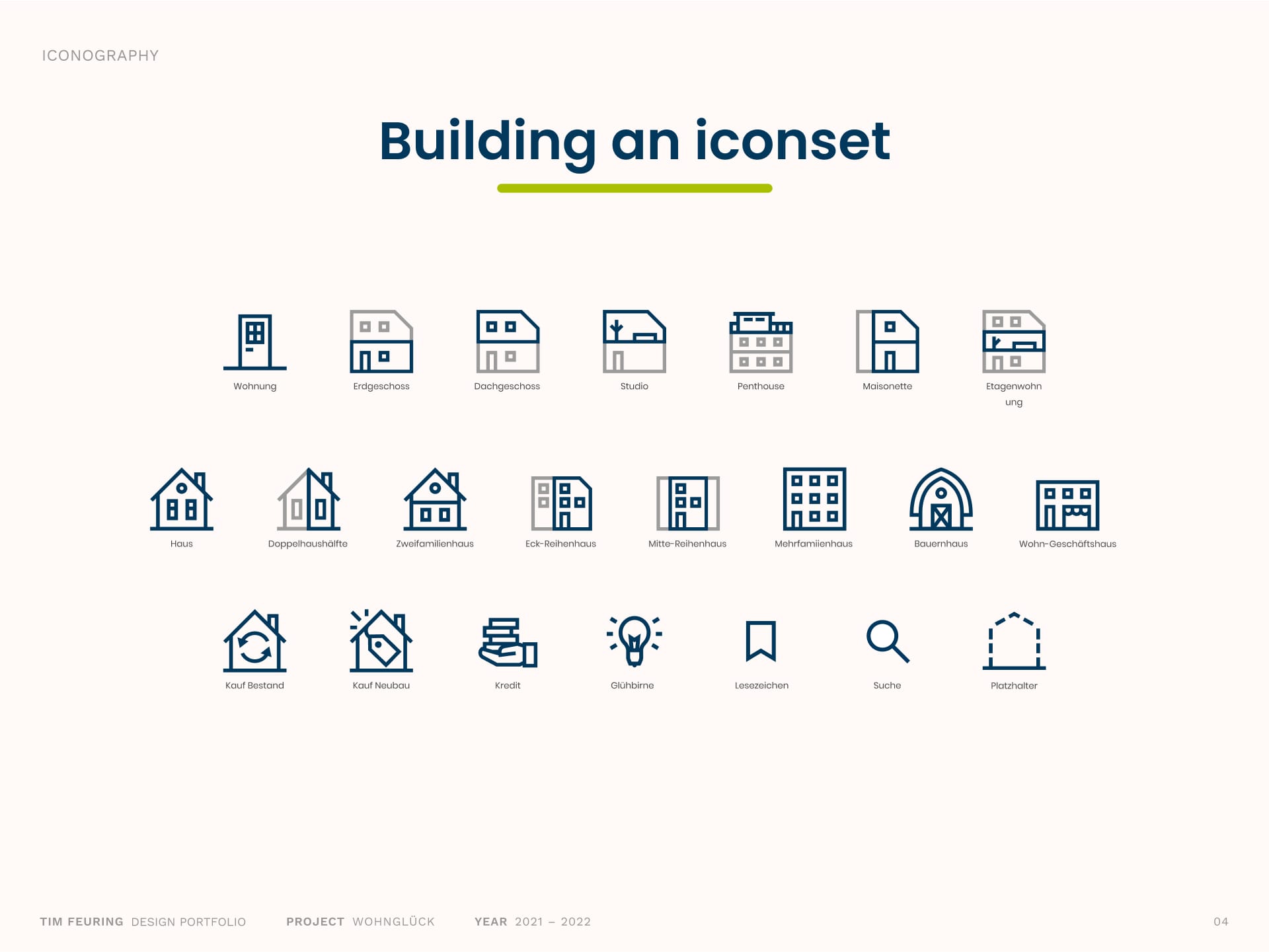
Starting from a small base, I expanded the existing icon style into a comprehensive set that represents housing types, service details, and more key platform features. The icons are functional and informative, using a consistent dark blue/grey color scheme that ensures clarity and recognizability.
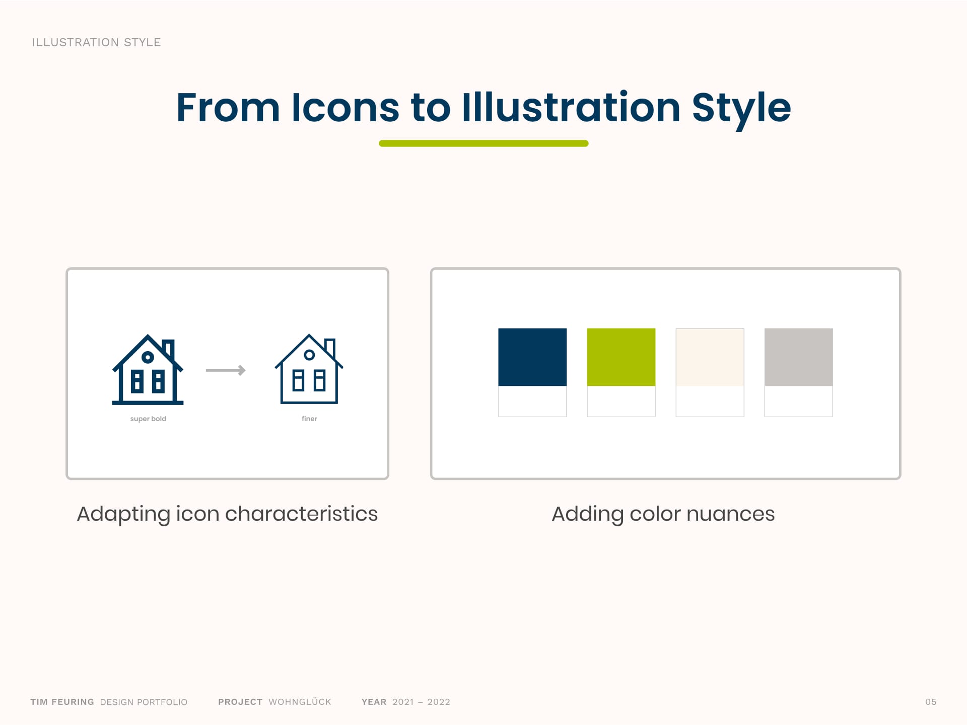
Building on the clear, geometric icon language, I derived a distinct illustration style that is consistent, friendly, and visualizes complex services.
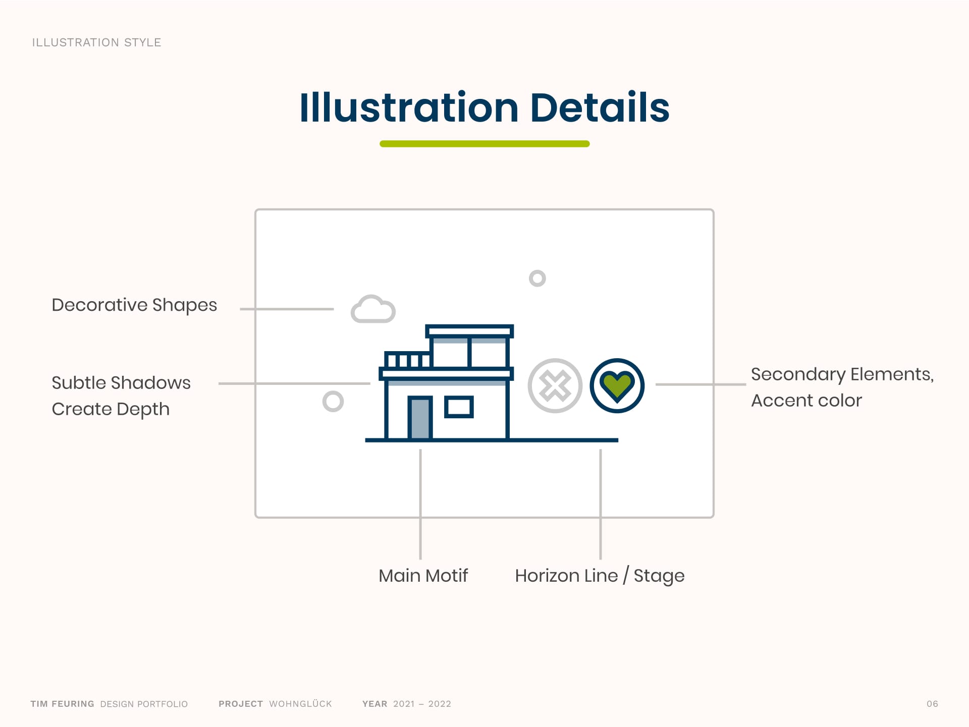
The illustrations are designed to feel human, approachable, and descriptive. Their function is to helping users understand abstract or complex services better. Clear outlines, geometric shapes and light details are combined in modern aesthetic. Scenes are often built on a horizon line, framed by decorative shapes and in connection to warm beige background, with green accent elements drawing attention to key details.
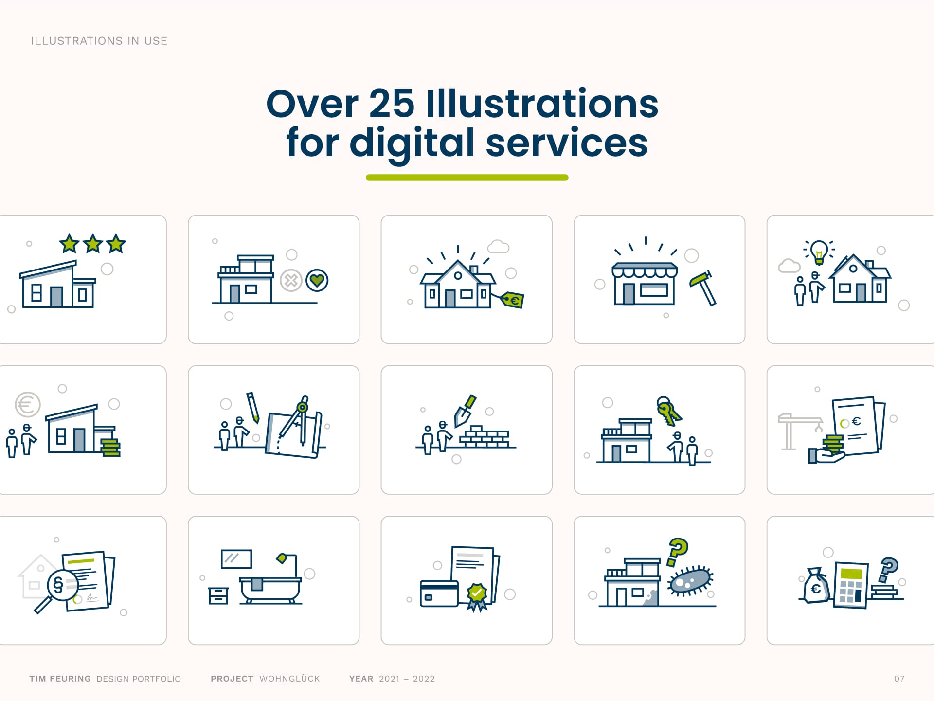
In total, I created more than 25 medium-sized illustrations to visually represent and support a wide range of services. These visuals are used across service banners and pages to make complex offerings approachable and engaging.
Illustrations in use
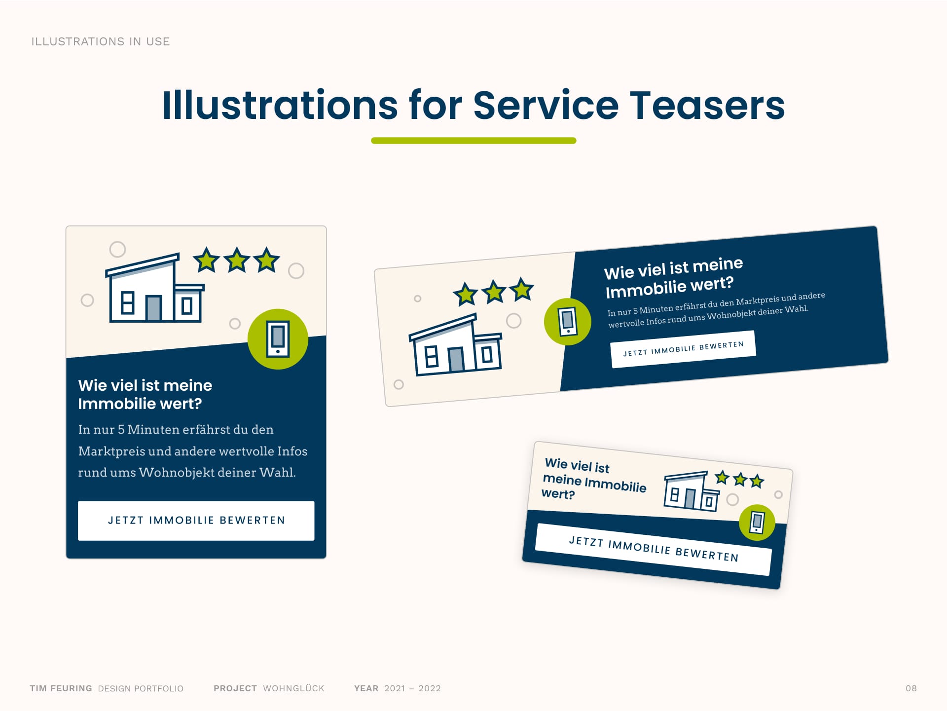
The Illustrations are used to enhance service banners and teasers, adding visual interest and helping users quickly understand the offerings. These banners were designed responsively and in multiple sizes to ensure a seamless experience across desktop and mobile devices.
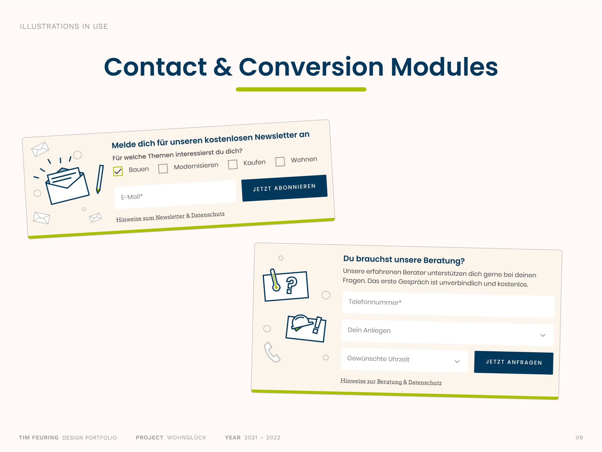
Small custom illustrations bring warmth and personality to contact and newsletter modules, making these touchpoints feel more inviting and relatable.
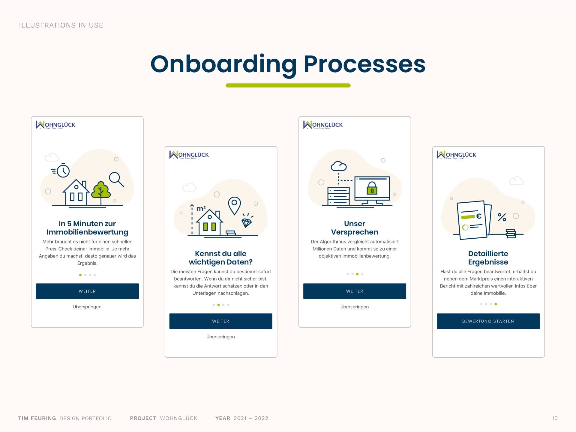
Custom illustrations guide users through the onboarding process, making complex services like property valuation more approachable and easier to understand, step by step.
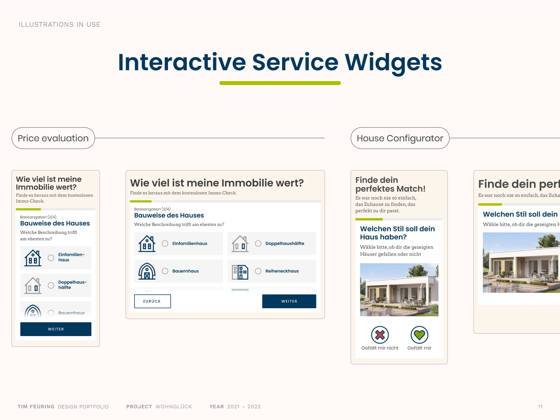
Icons and illustrations enrich the user experience within interactive widgets, like the property valuation tool and house configurator, making the processes more intuitive and engaging.
Systemizing the new design
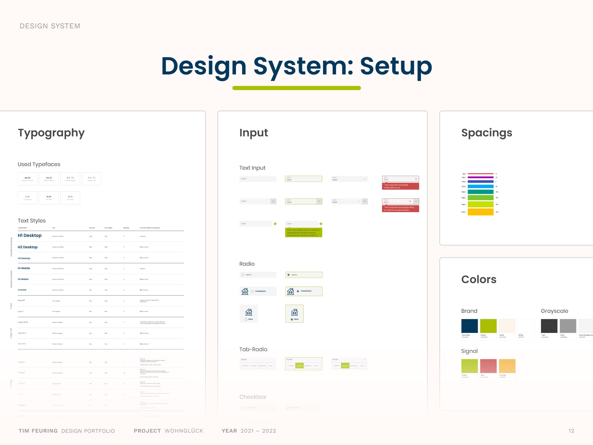
I built and maintained a comprehensive design system that brought all design elements like colors, typography, icons, illustrations, and UI modules into a cohesive framework. This systematization enabled a consistent application across the platform, simplified collaboration in the team, and made future updates more efficient.
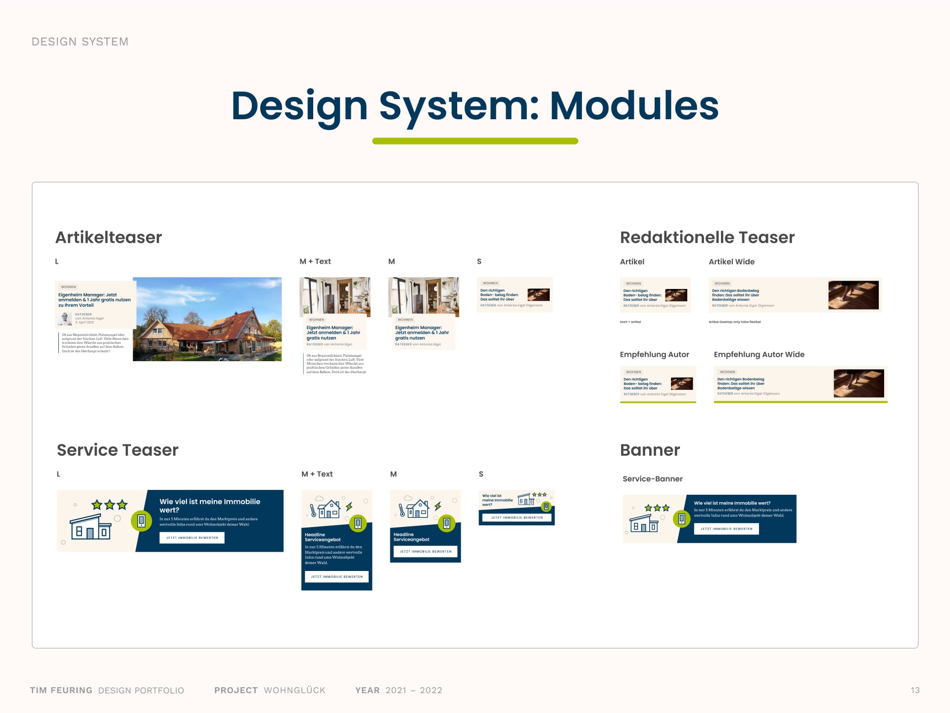
Reusable and adaptable modules like article teasers, service banners, and link elements form the backbone of the platform’s consistent and scalable interface. The modular system supports both desktop and mobile and ensures a seamless user experience across devices.
Illustration Spotlight
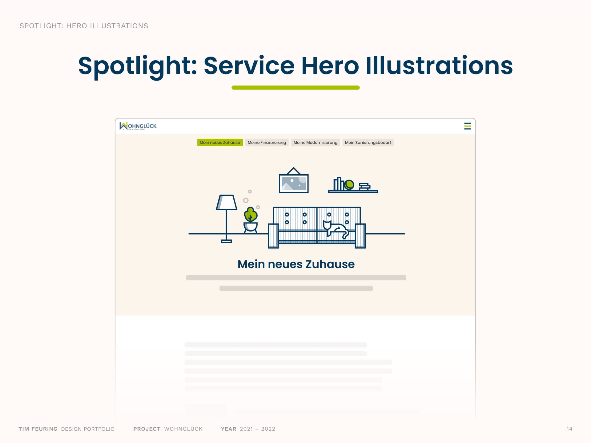
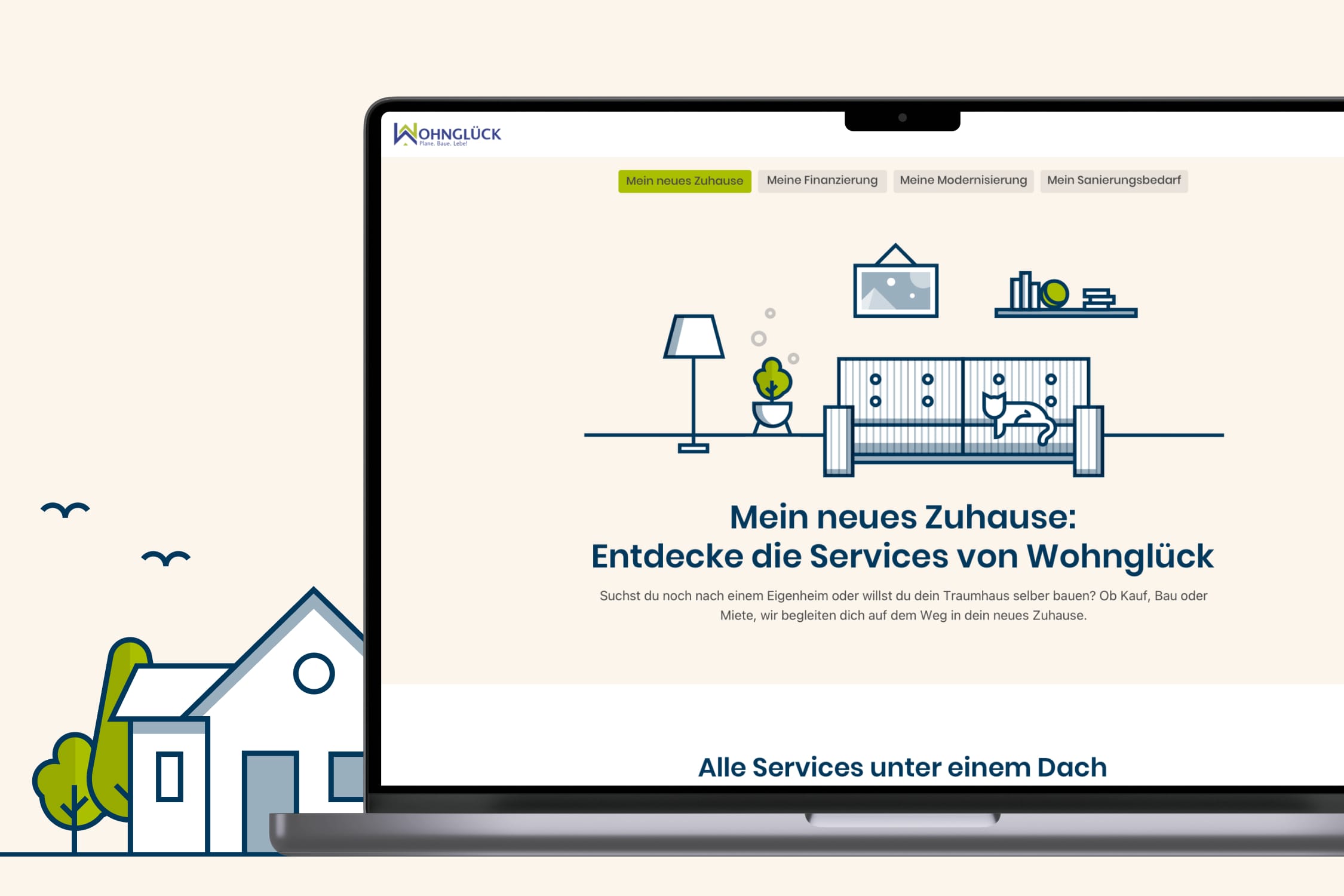
To bring structure and clarity to the growing ecosystem of offerings, we grouped related services into thematic families: The „Service Worlds“. Each world is introduced with a detailed hero illustration that sets the scene for its sub-services. This helped users better navigate the platform while giving each area its own key illustration.
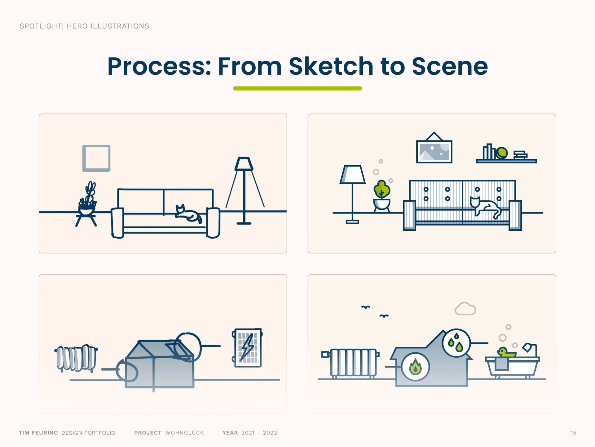
Each illustration began with idea generation around the service topics, followed by rough digital sketches to explore the composition. Once the direction was clear, I translated the sketches into clean vector artwork.
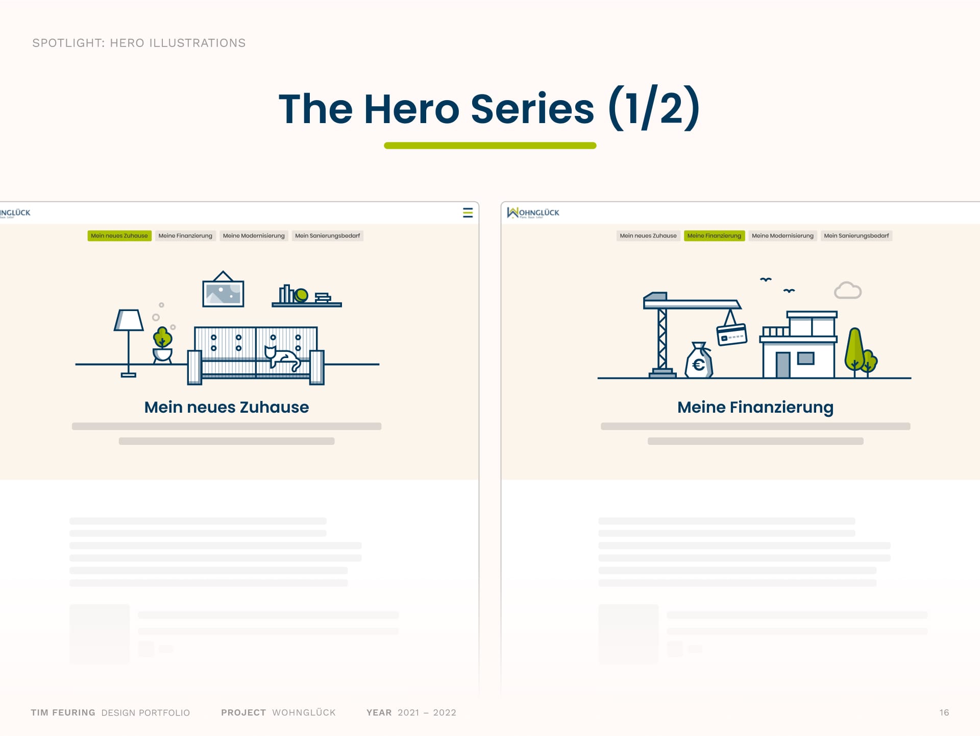
Illustrations for „Mein neues Zuhause” and „Meine Finanzierung” form the visual anchors of their service worlds, helping users quickly understand the context and value of each offering.
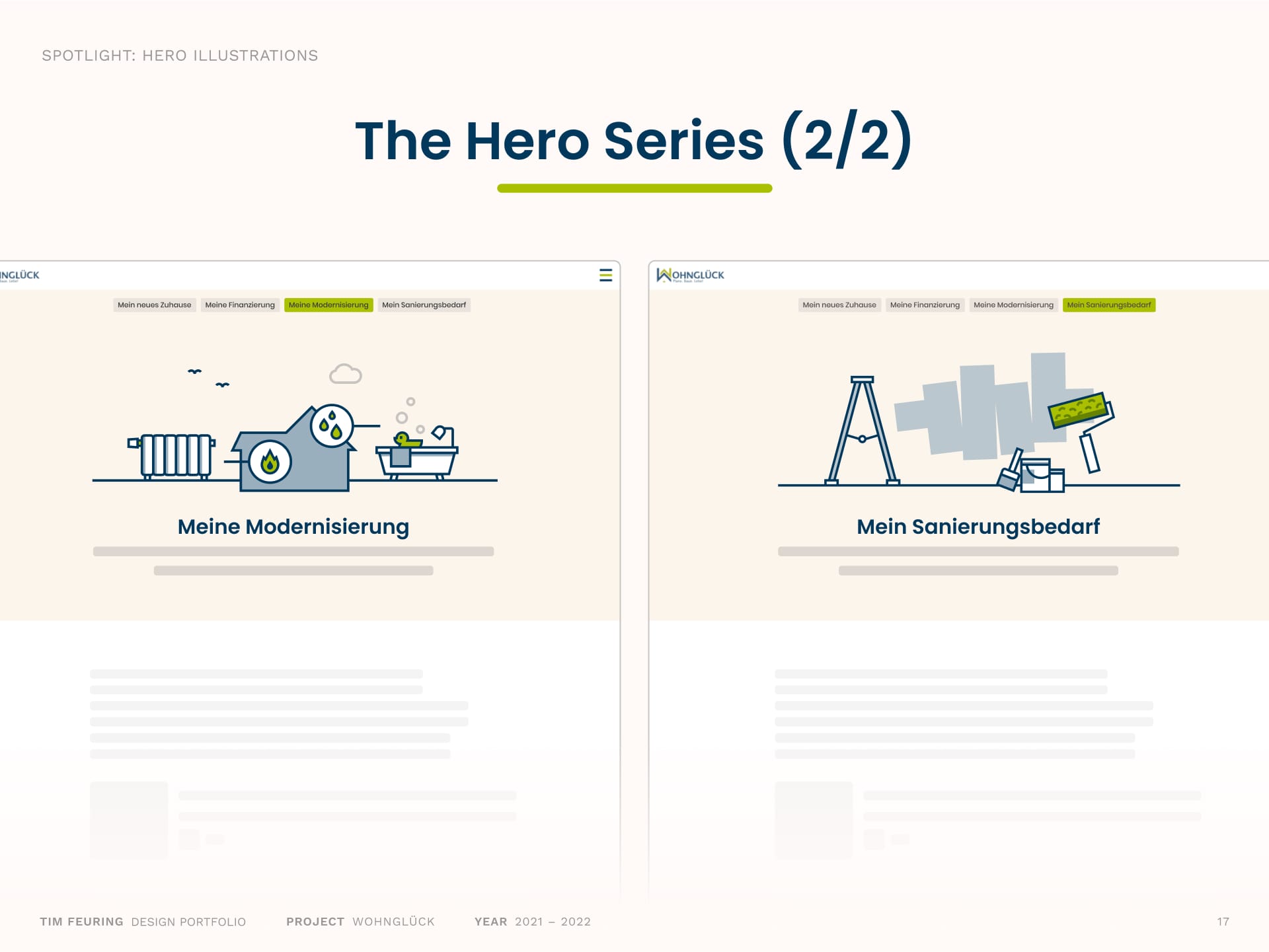
Scenes for „Meine Modernisierung“ and „Mein Sanierungsbedarf“ continue the series, combining informative detail with visual warmth to support the service entries.
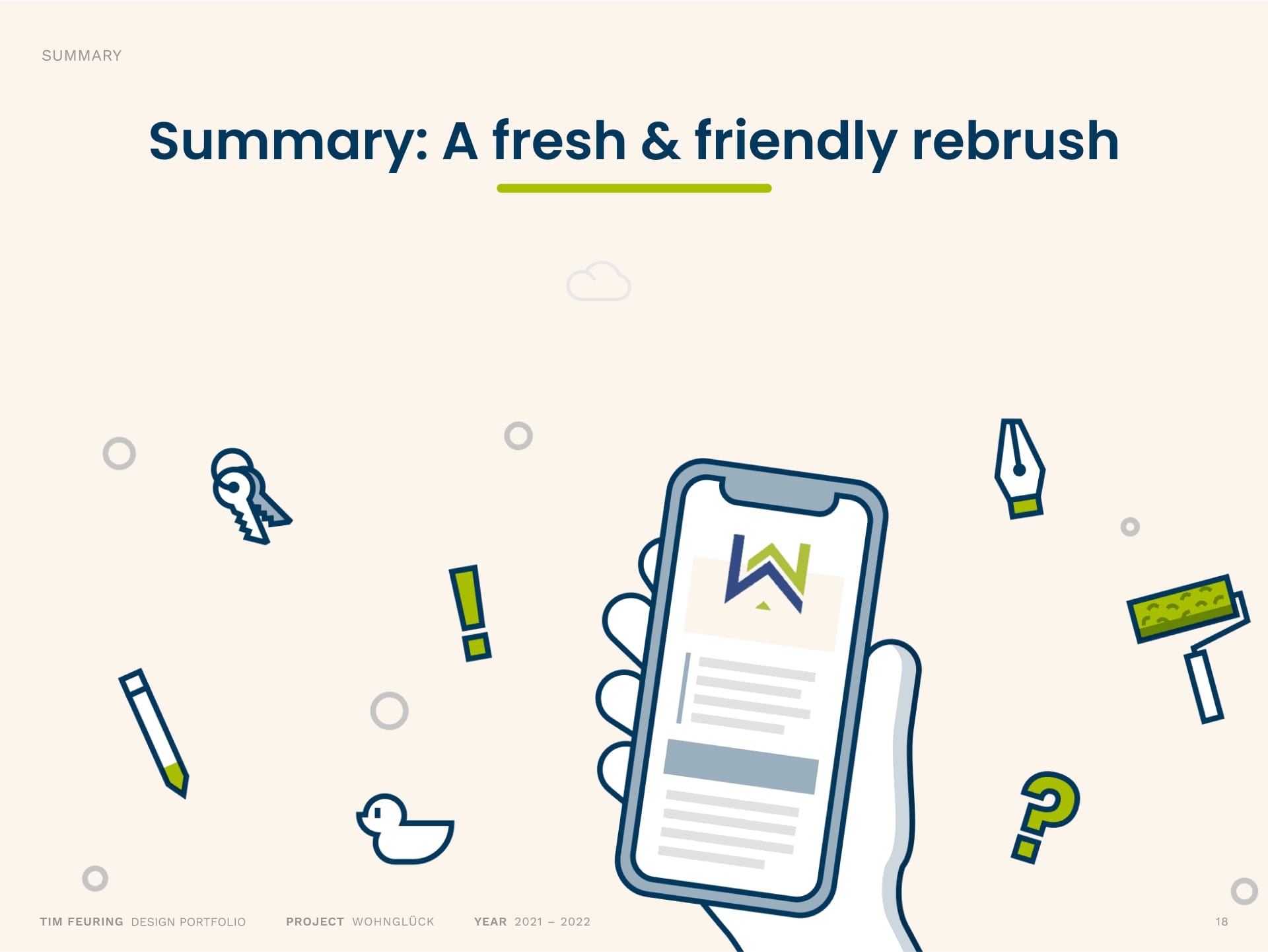
The redesign of Wohnglück was about more than just updating visuals, it was a collaborative effort to make the platform more helpful, approachable, and engaging for users. By aligning illustration, iconography, and interface design with the evolving service offering, we created a warmer, more consistent experience that better reflects the platform’s values and its growing ecosystem. A design system now ensures these improvements scale, clearly, cohesive, and with care.