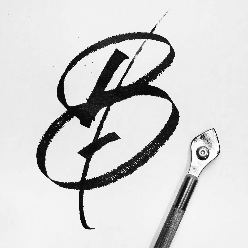
 A broad brush-painted B explores contrast, texture and movement.
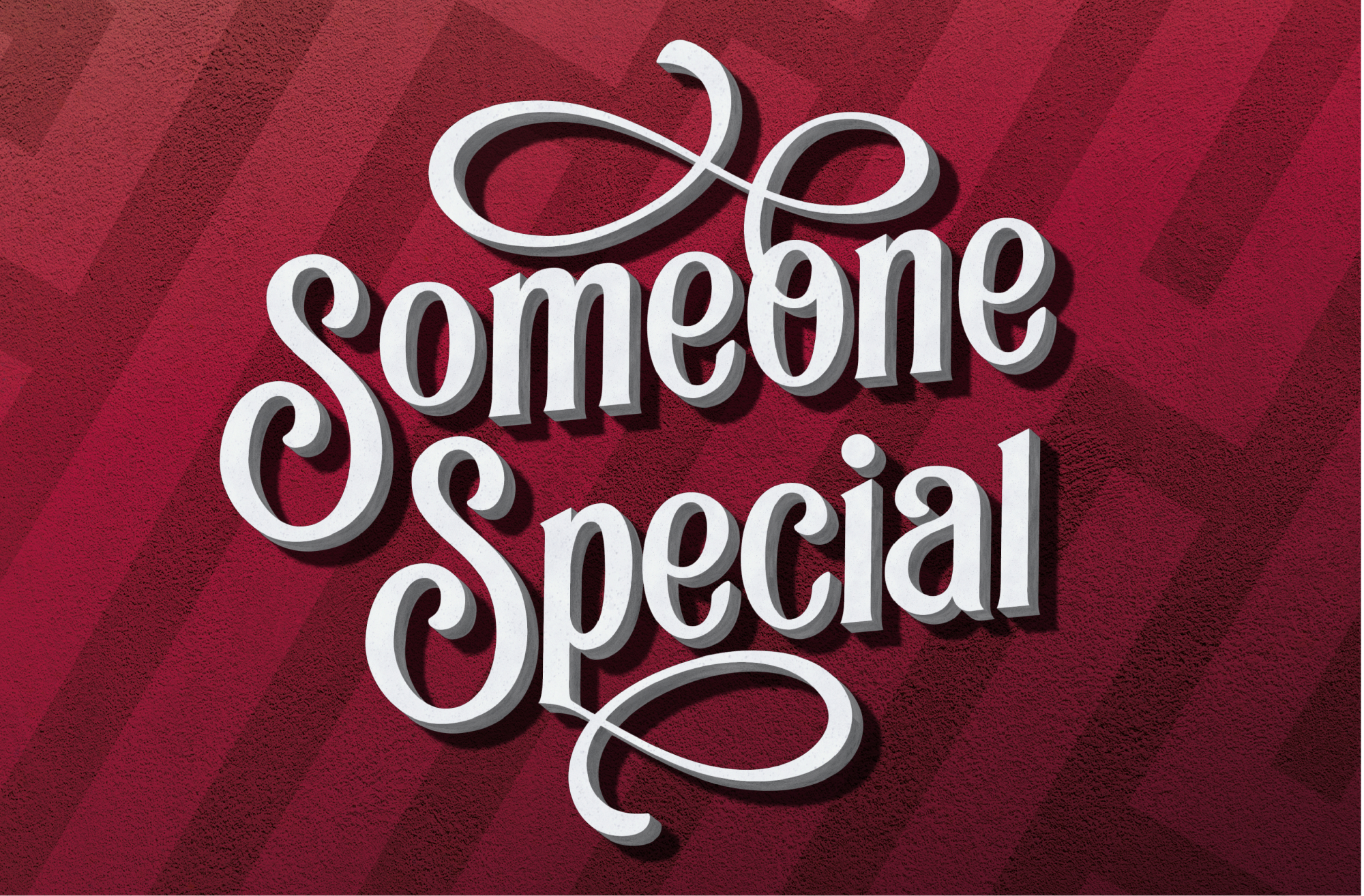
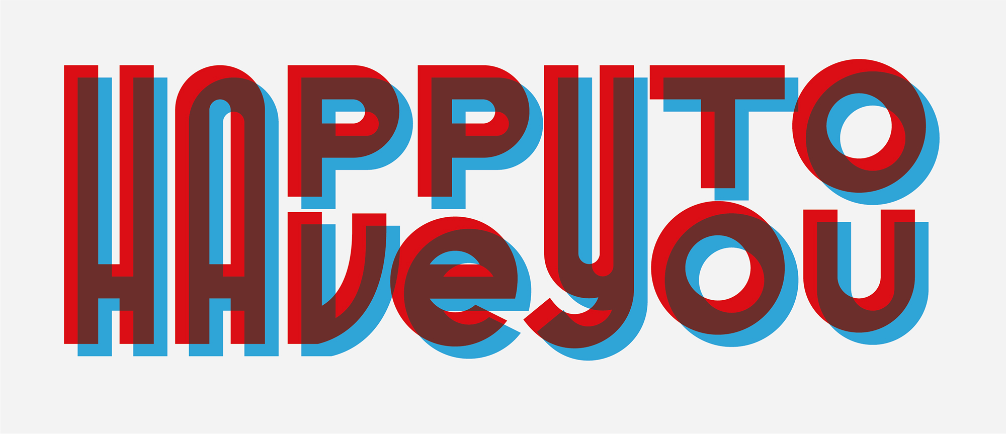 Offset red and blue type gives this compliment-card design a lively layered effect.
 A simple bedroom scene combines a resting figure, cat and everyday objects.
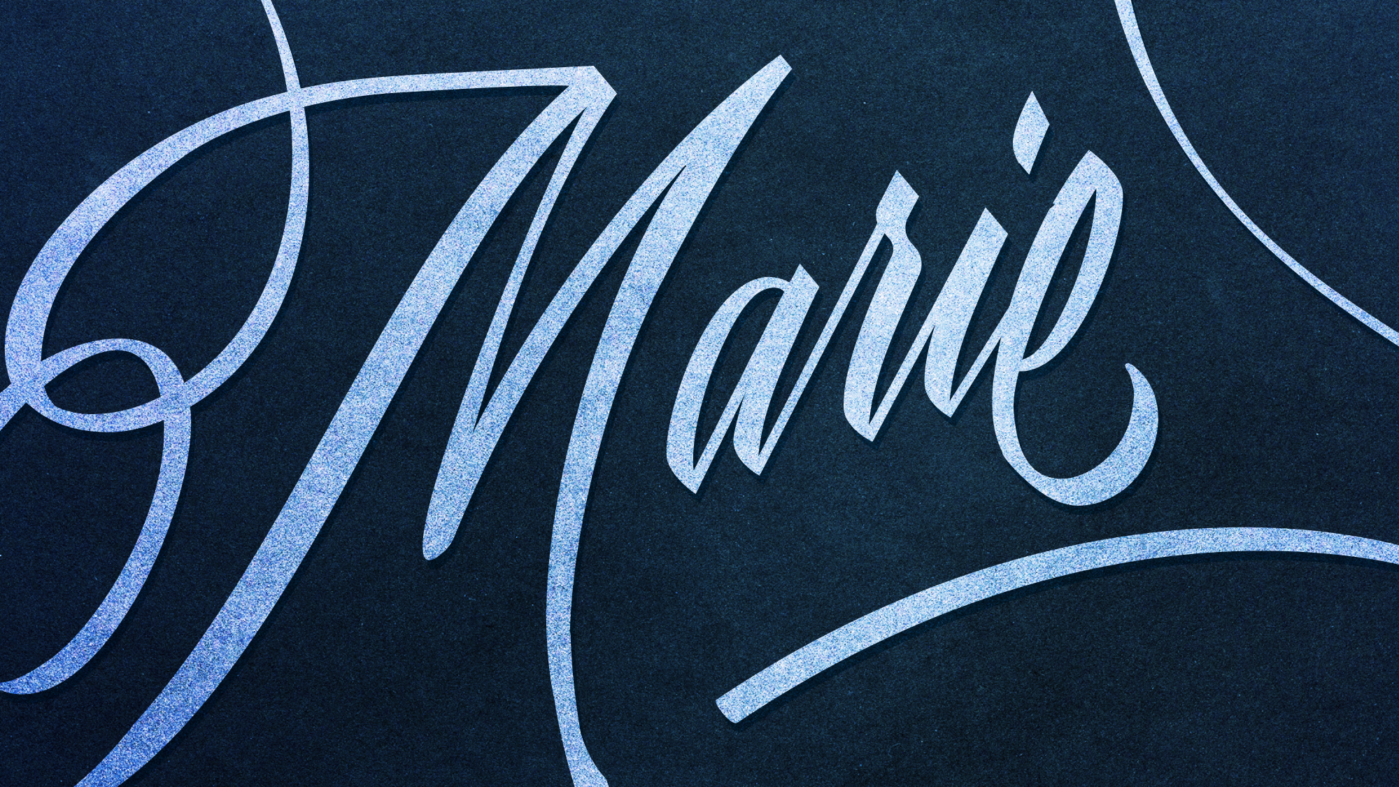 A close crop emphasizes the grain and contrast of white script on blue.
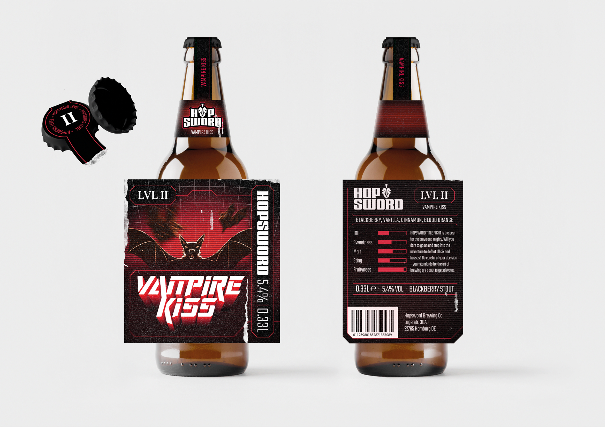
 A dark red and black Vampire Kiss stout identity applied to bottle packaging.
 A bold blackletter-inspired Hopsword logo pairs the name with a hop symbol.
 A high-contrast pub-style sign frames Guinness lettering with stippled borders.
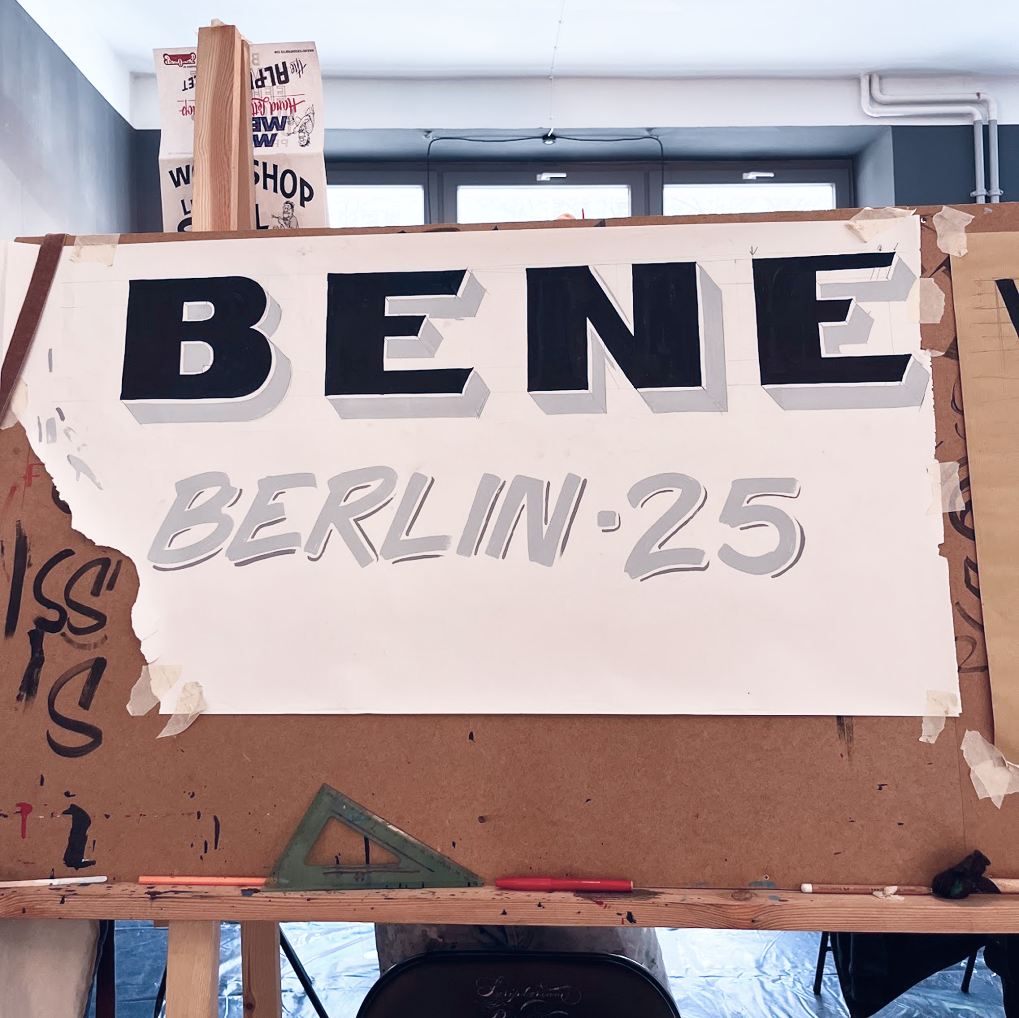
 A handwritten word study tests rhythm and a subtle dimensional shadow.
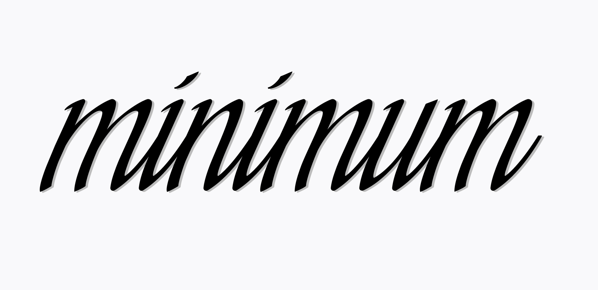 A paired infographic explains symptoms affecting the nose and skin.
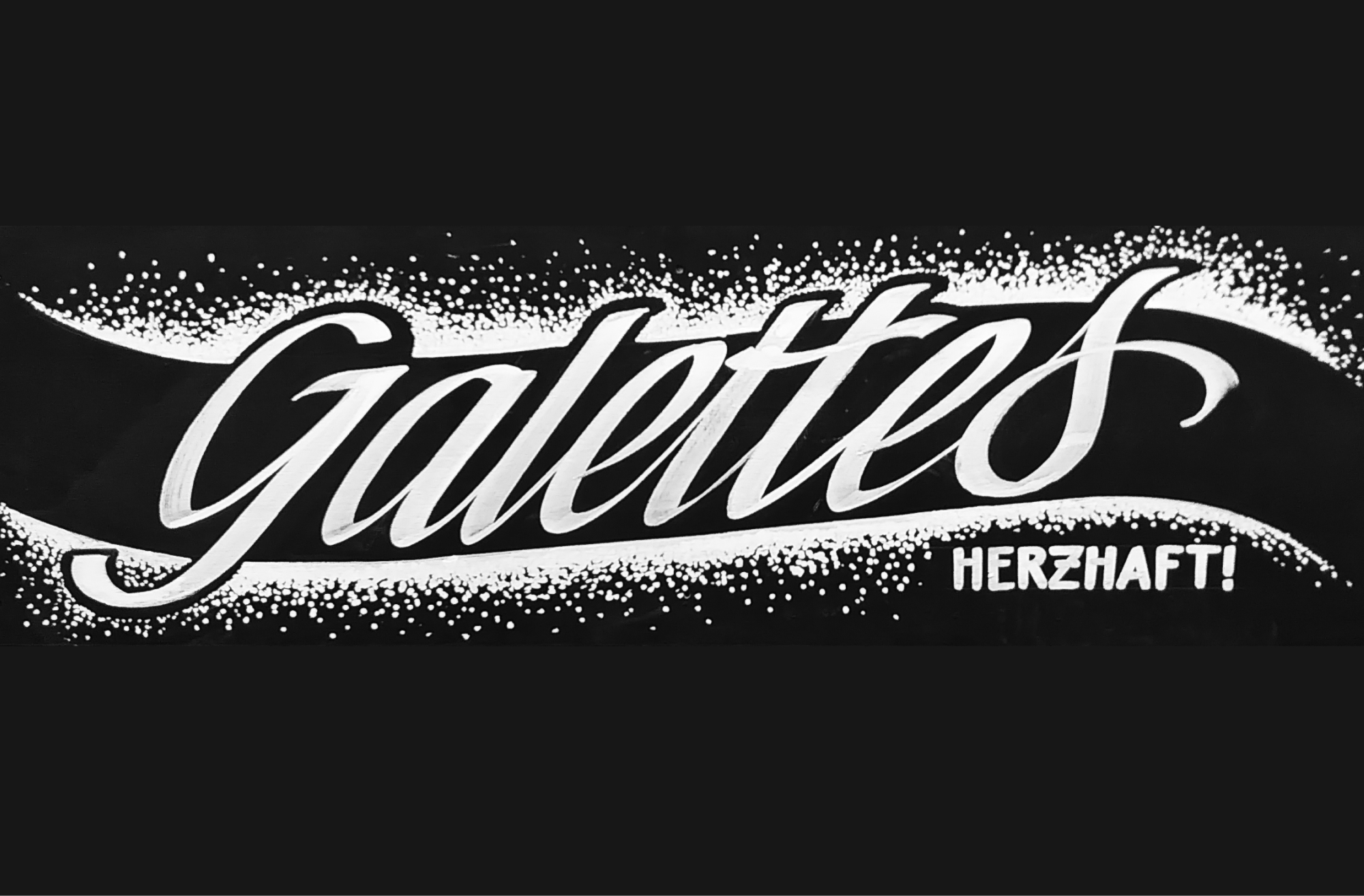
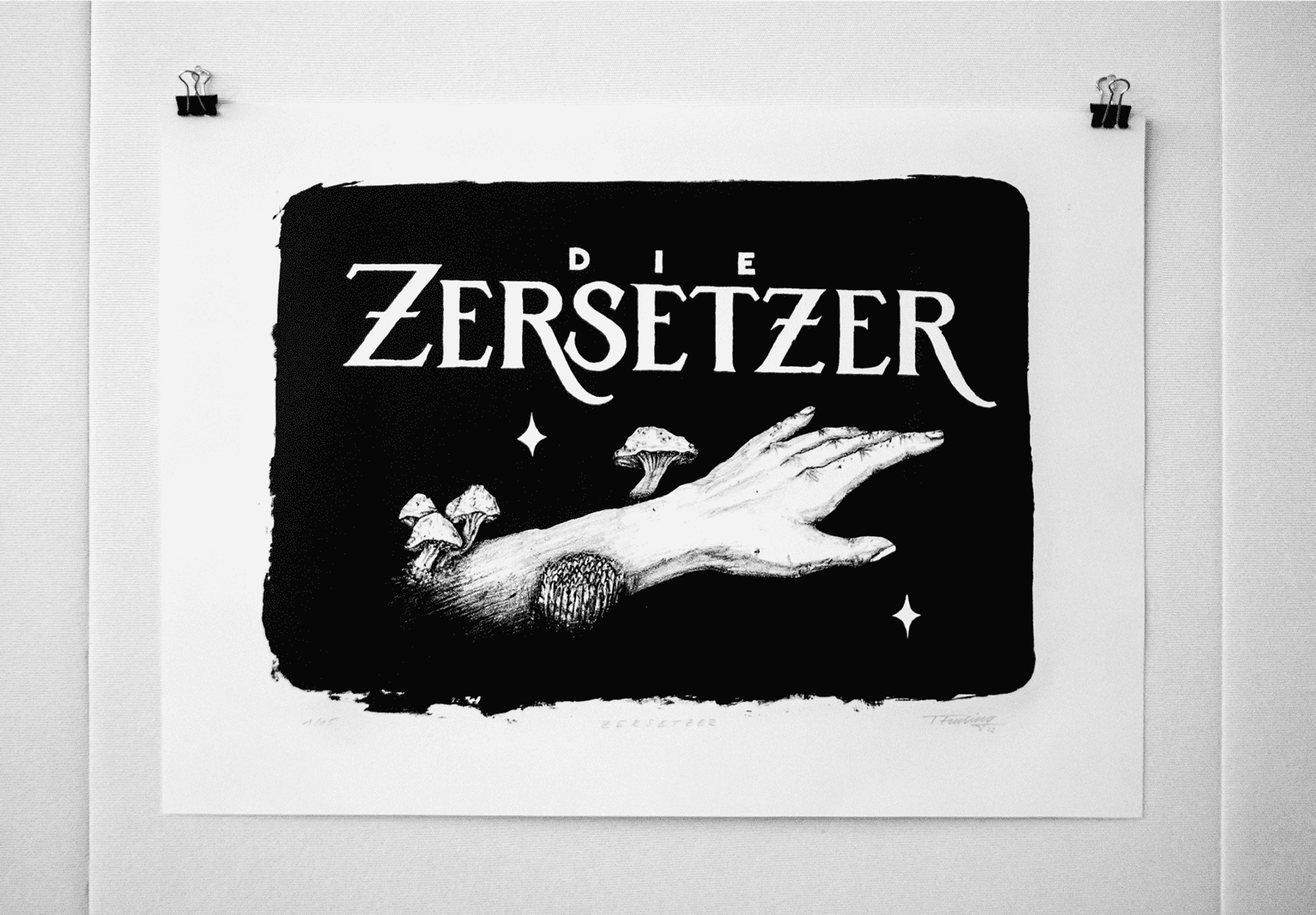
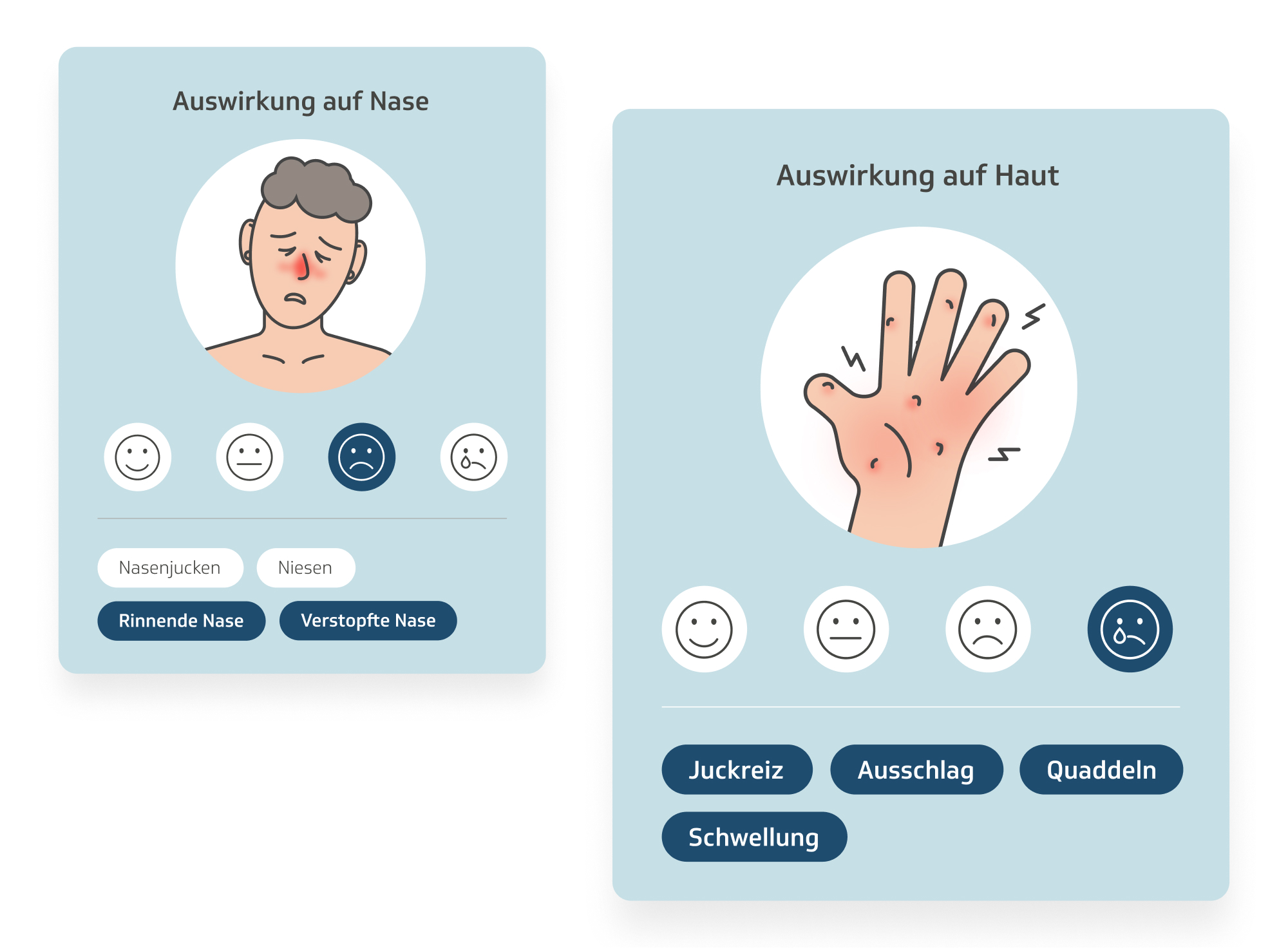 Expressive white lettering is set against a rough, stippled black shape.
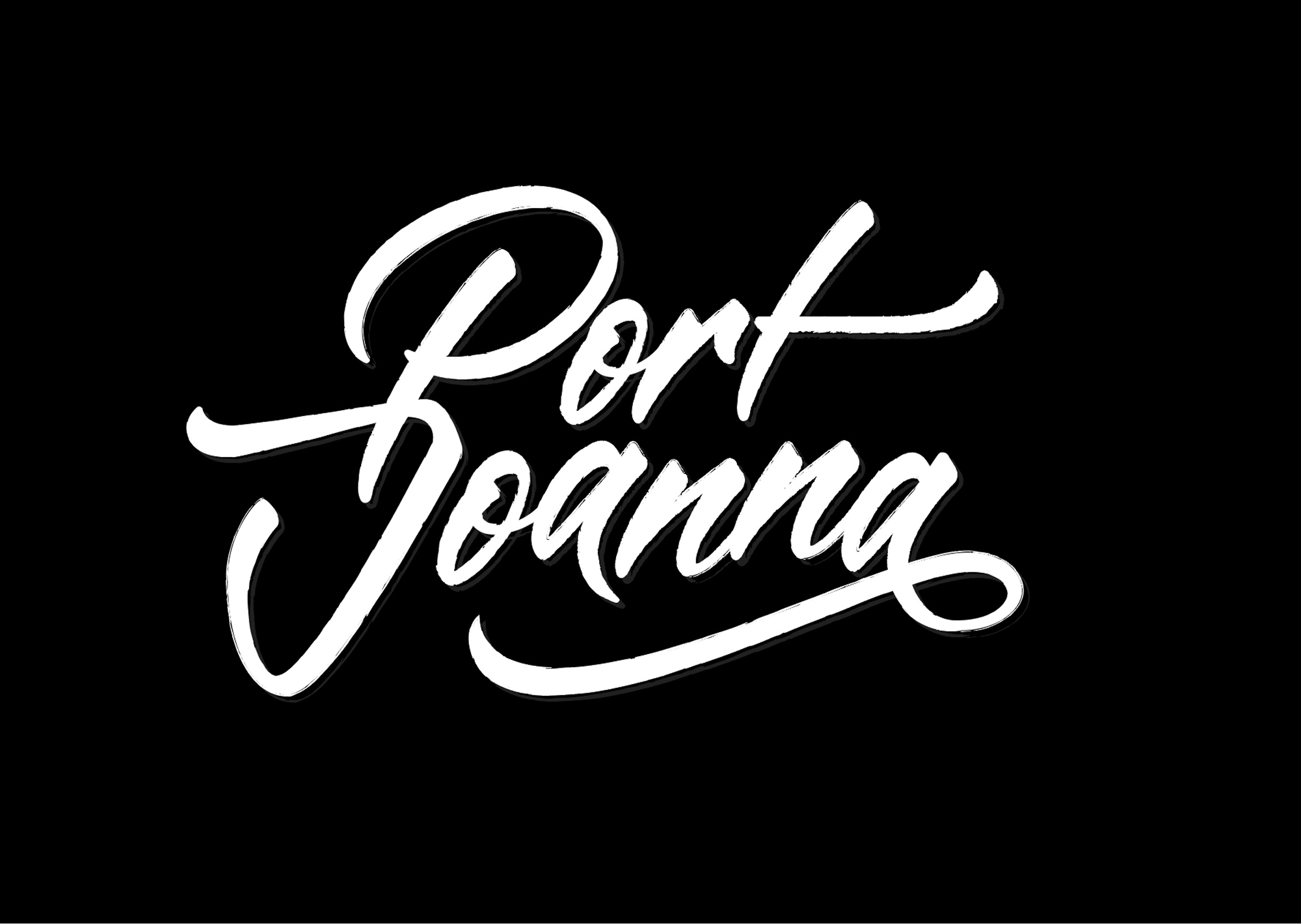 A close lettering study explores repeated forms, slant and rhythm.
 A playful dinosaur illustration uses bright green shapes and simple highlights.
 A minimal line study explores interlocking curves and open forms.
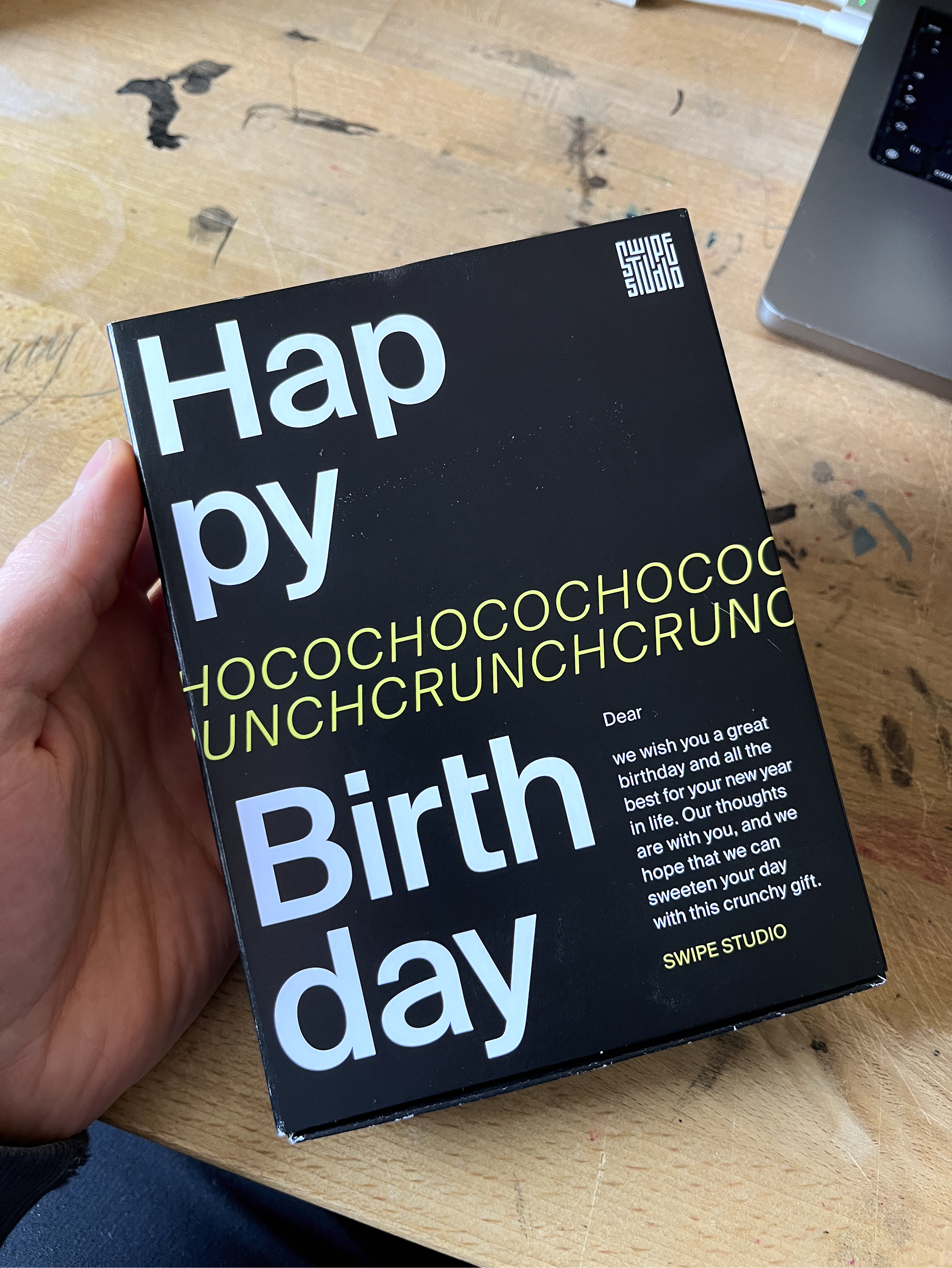
 A playful birthday message uses oversized, high-contrast display lettering.
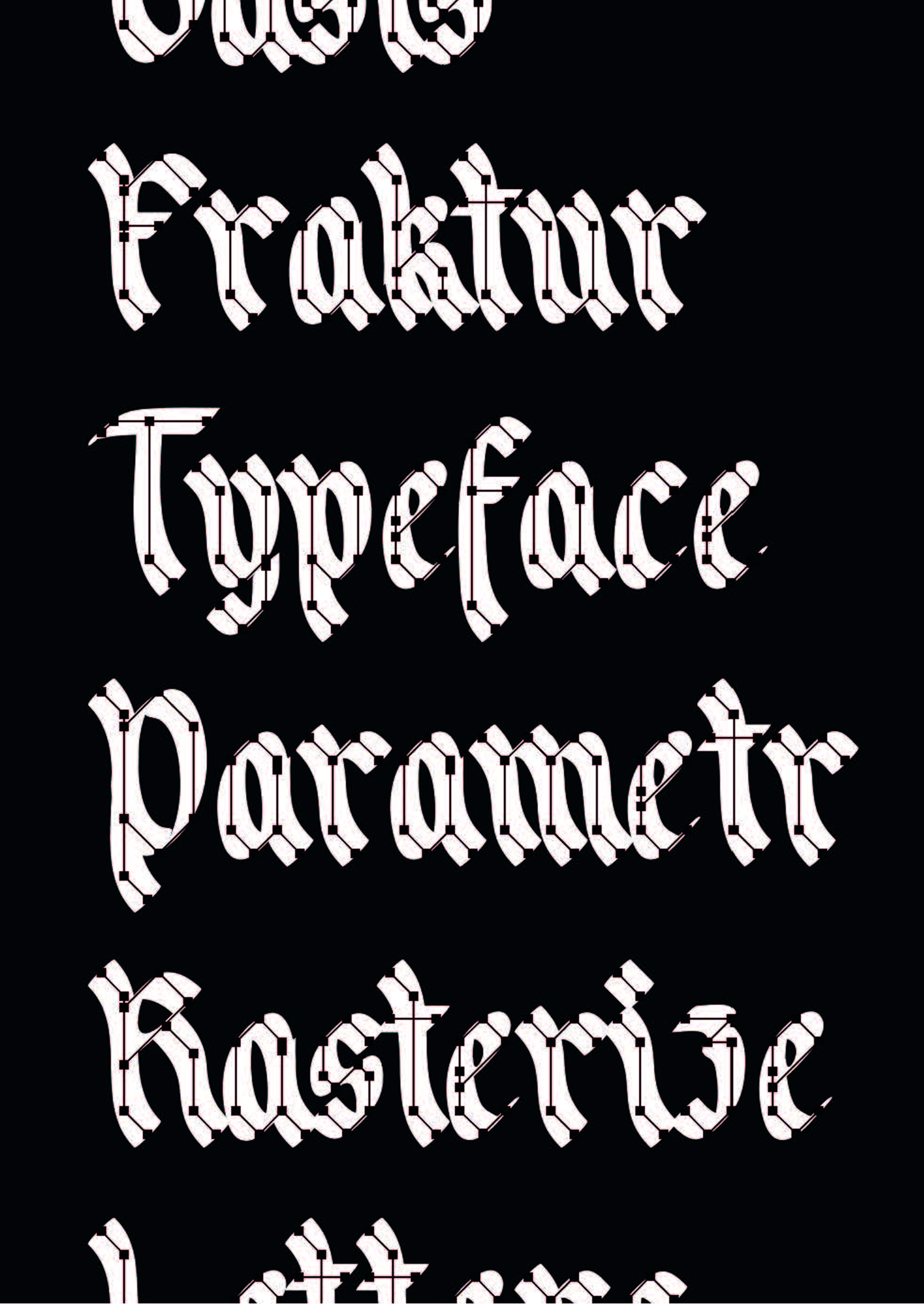
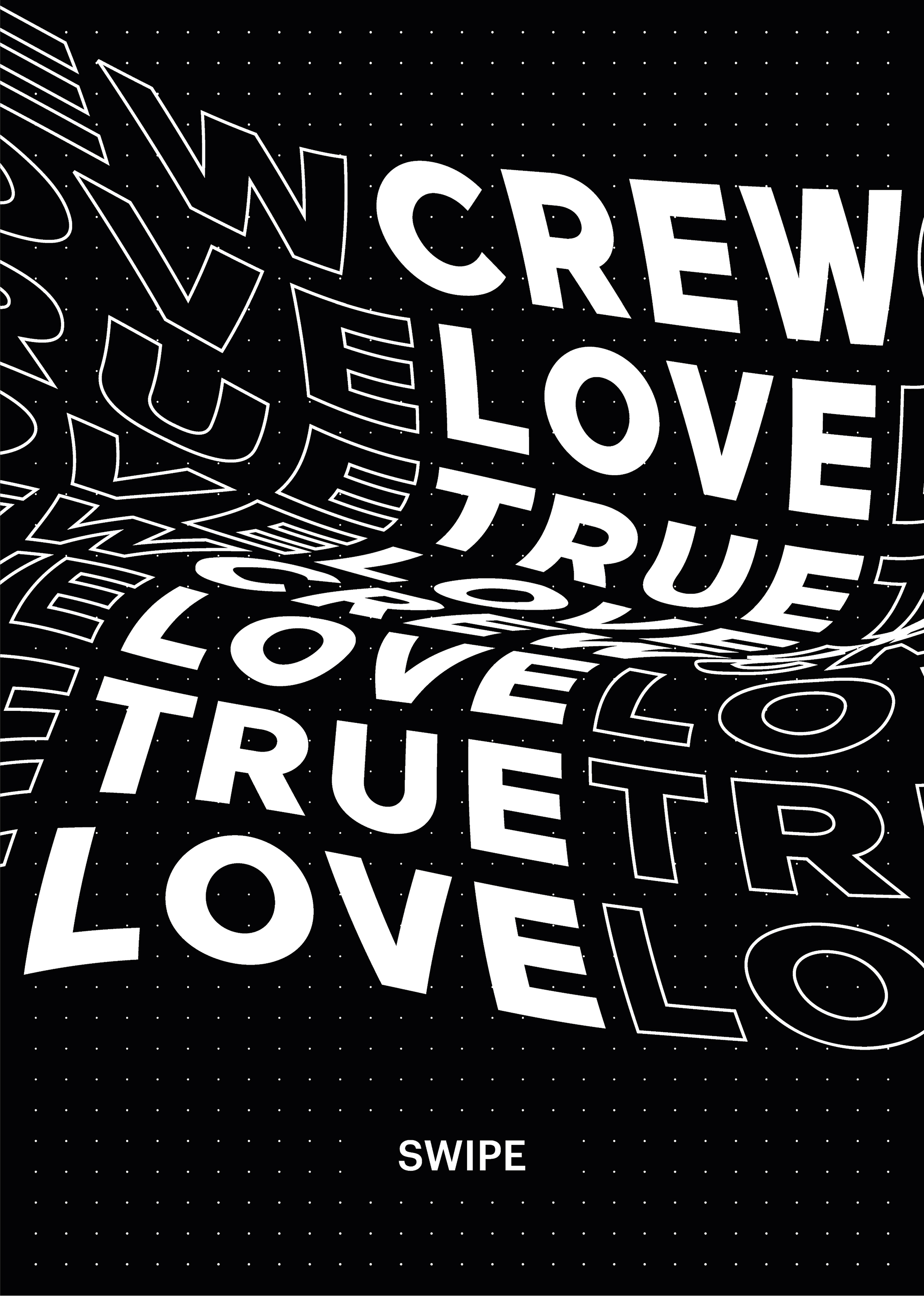
 Distorted display typography turns a repeated phrase into a dense poster composition.
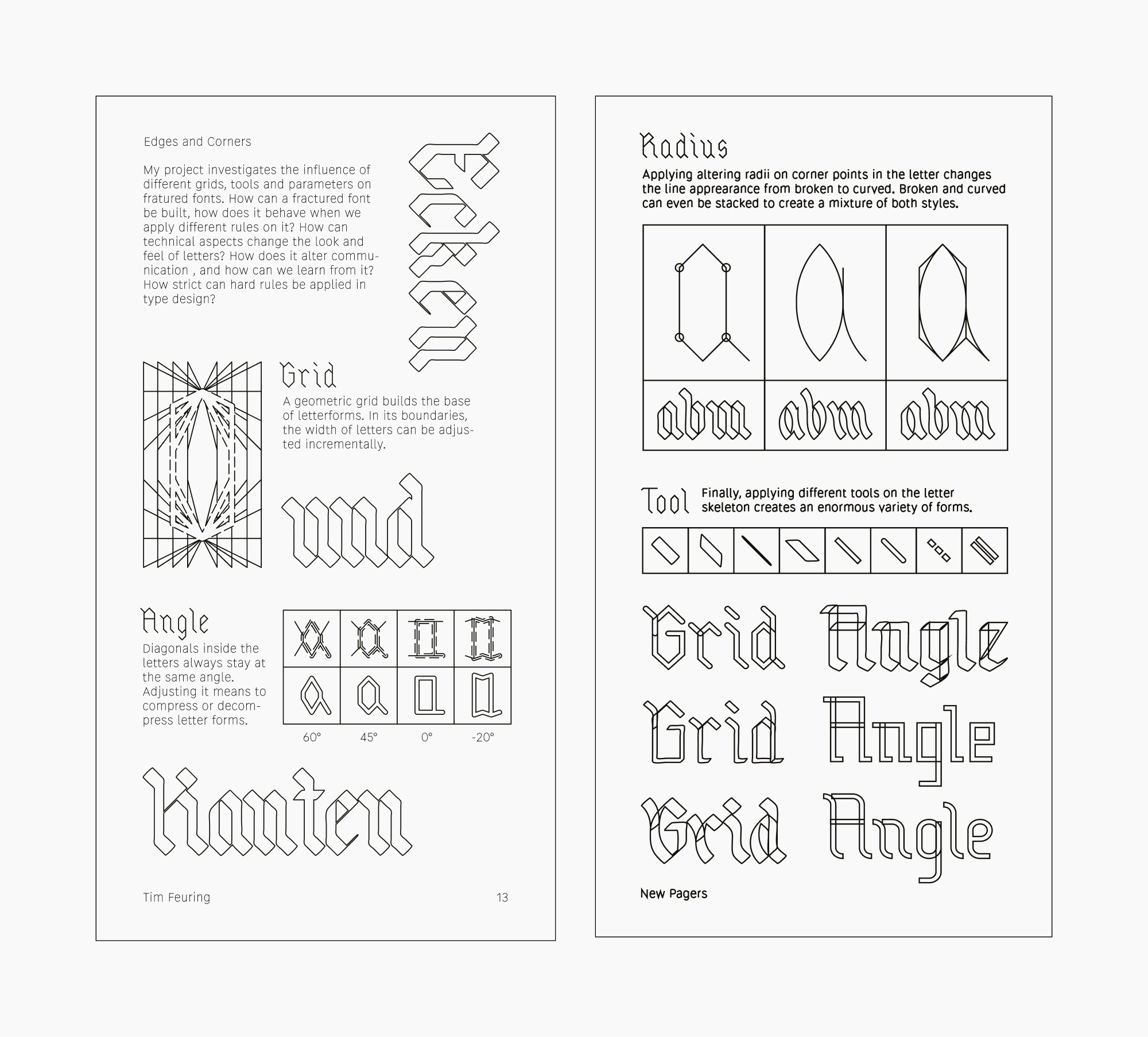
 New Pagers process sheets document grids, edges, radii and tool experiments.
 A colorful editorial graphic pairs a character illustration with concise guidance.
 A cropped type study highlights the sharp forms and construction details of blackletter.
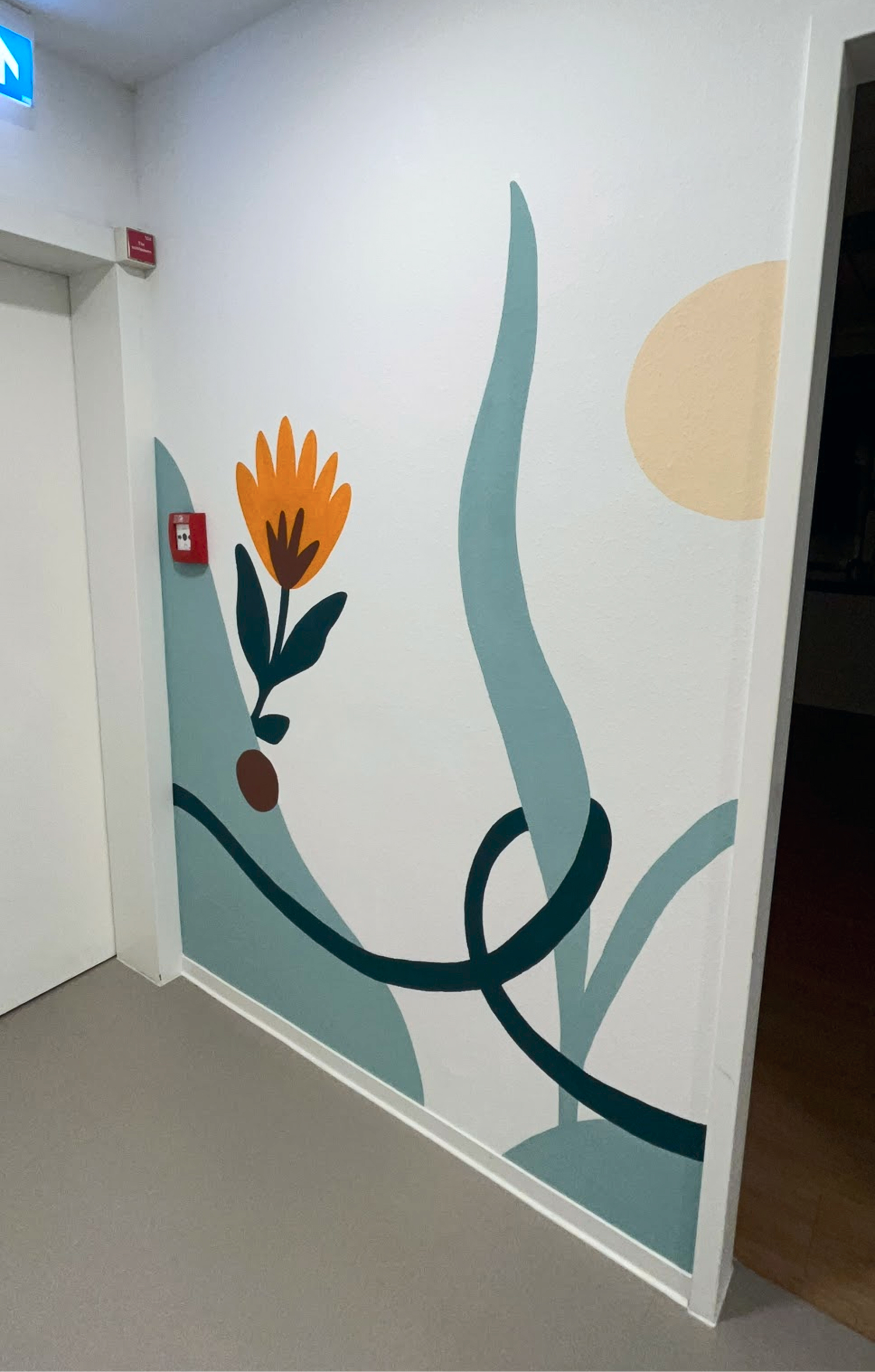
 Large abstract leaves and a flower bring color to a community garden wall.
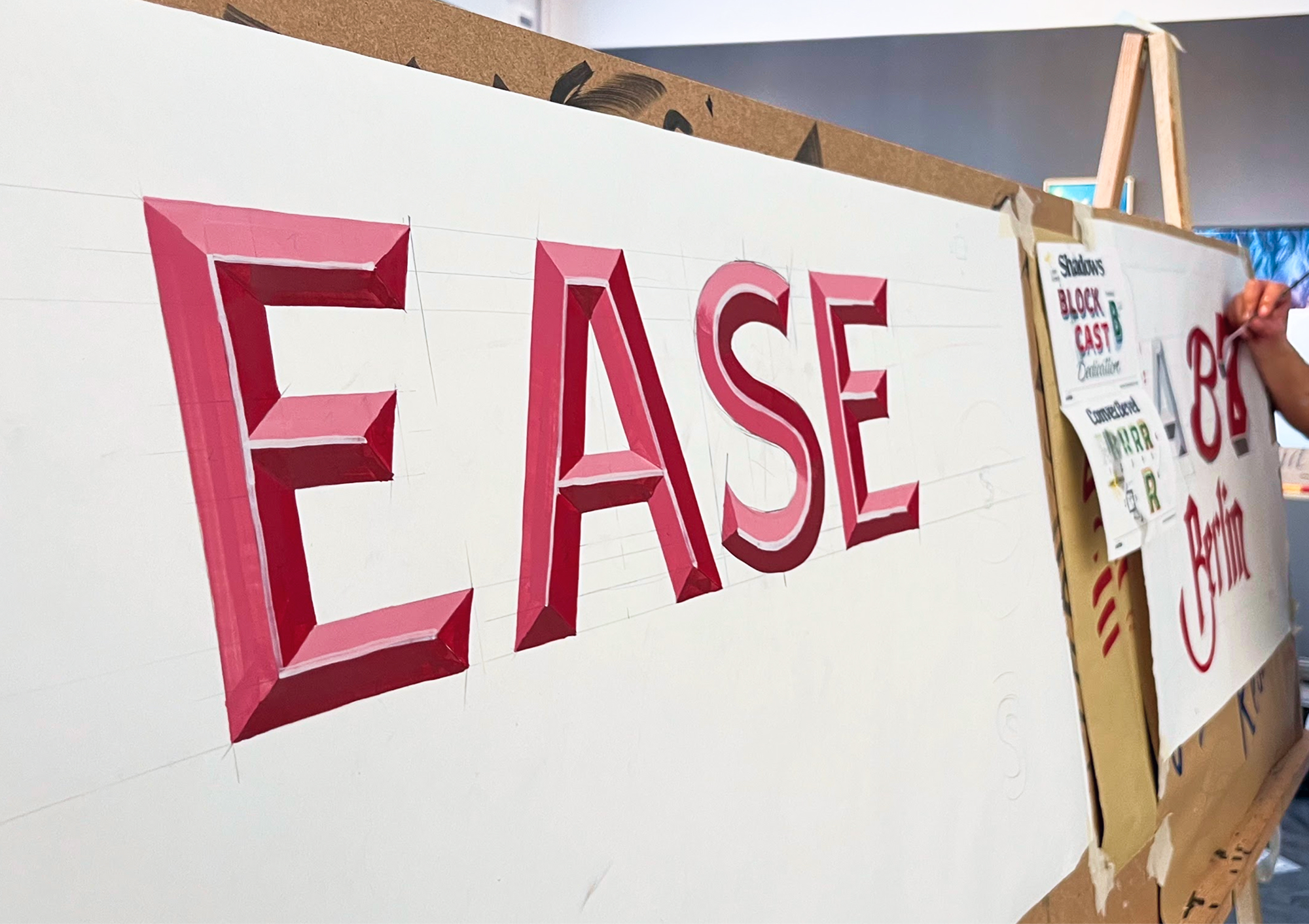
 A hand-painted EASE sign shows shaded block lettering in progress.
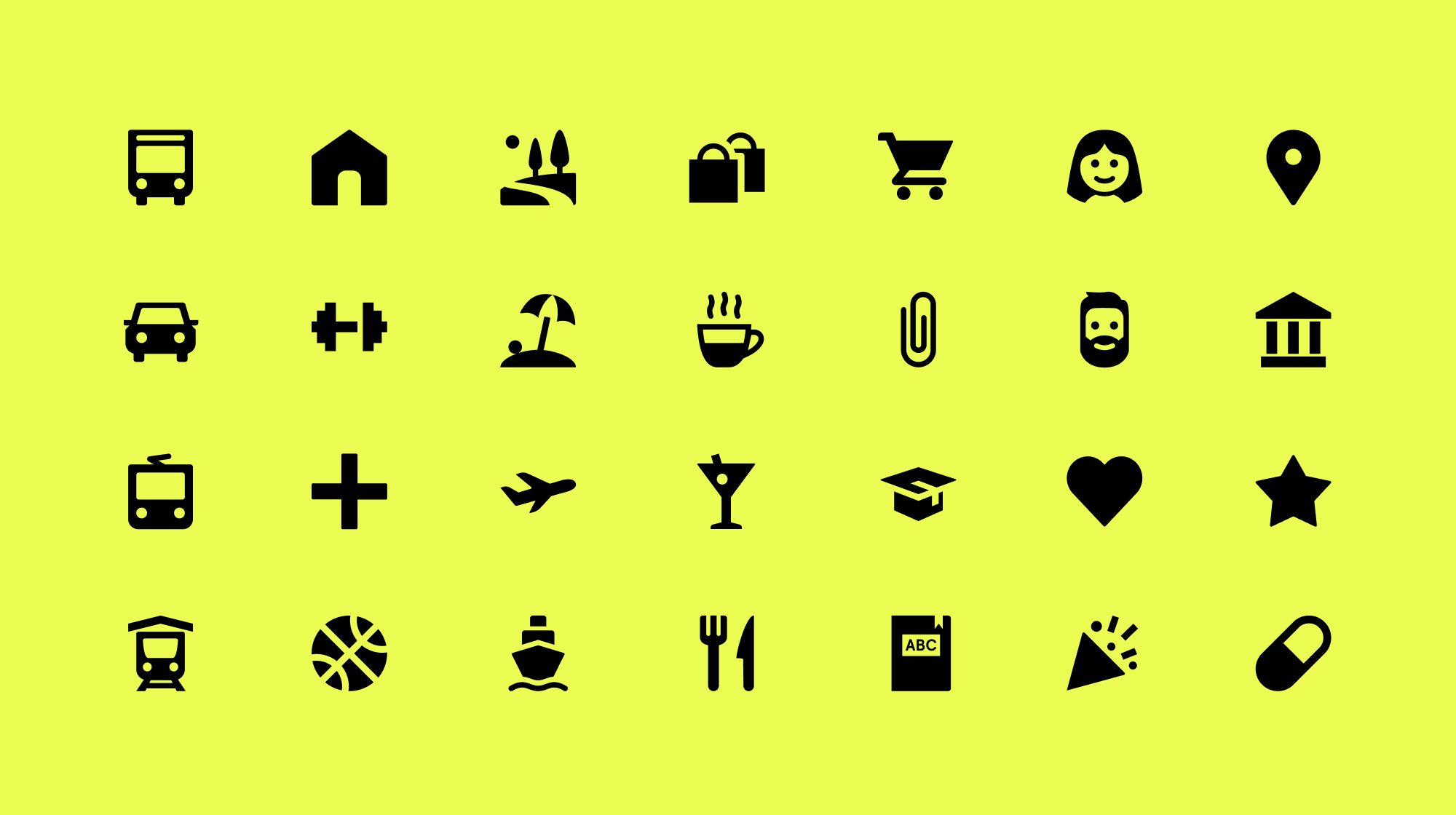 A compact icon set covers travel, home, shopping, people and everyday activities.
 A simple organic symbol balances rounded leaves with open circular strokes.
 An oversized typographic L turns a single letter into a graphic composition.
 A colorful concept image introduces the Dreamy Donuts visual identity.
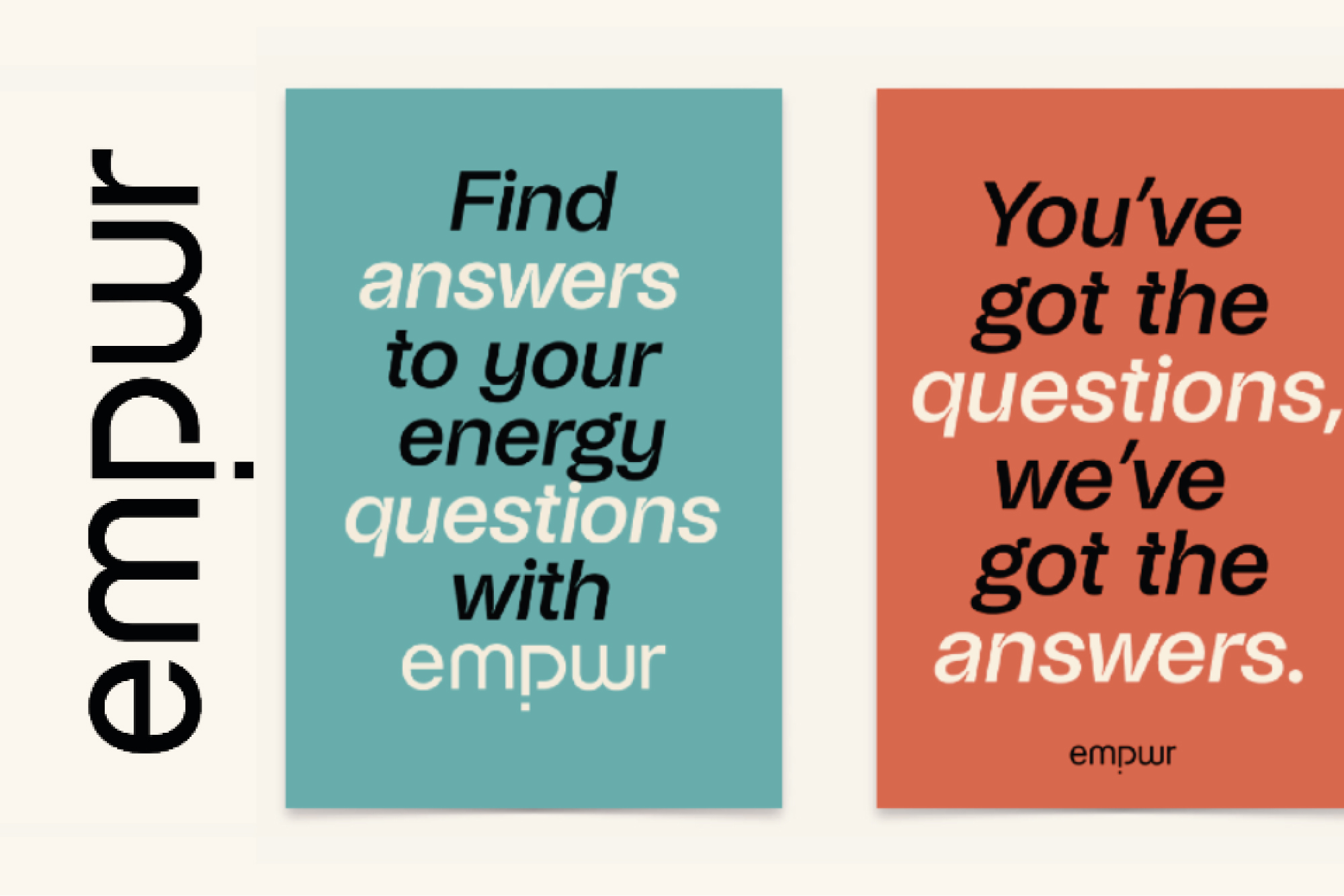 A poster pair promotes empwr with bold typography and contrasting colors.
 An animated script logo reveals the Extra Butter identity.
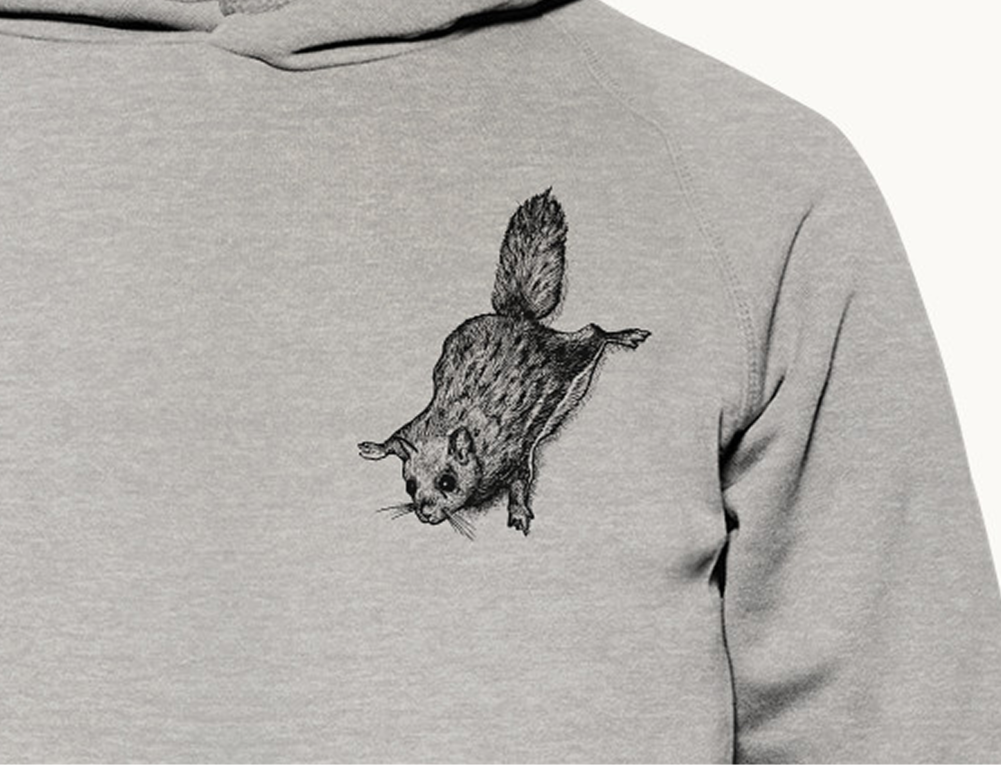 A pencil-style squirrel illustration becomes a subtle apparel graphic.
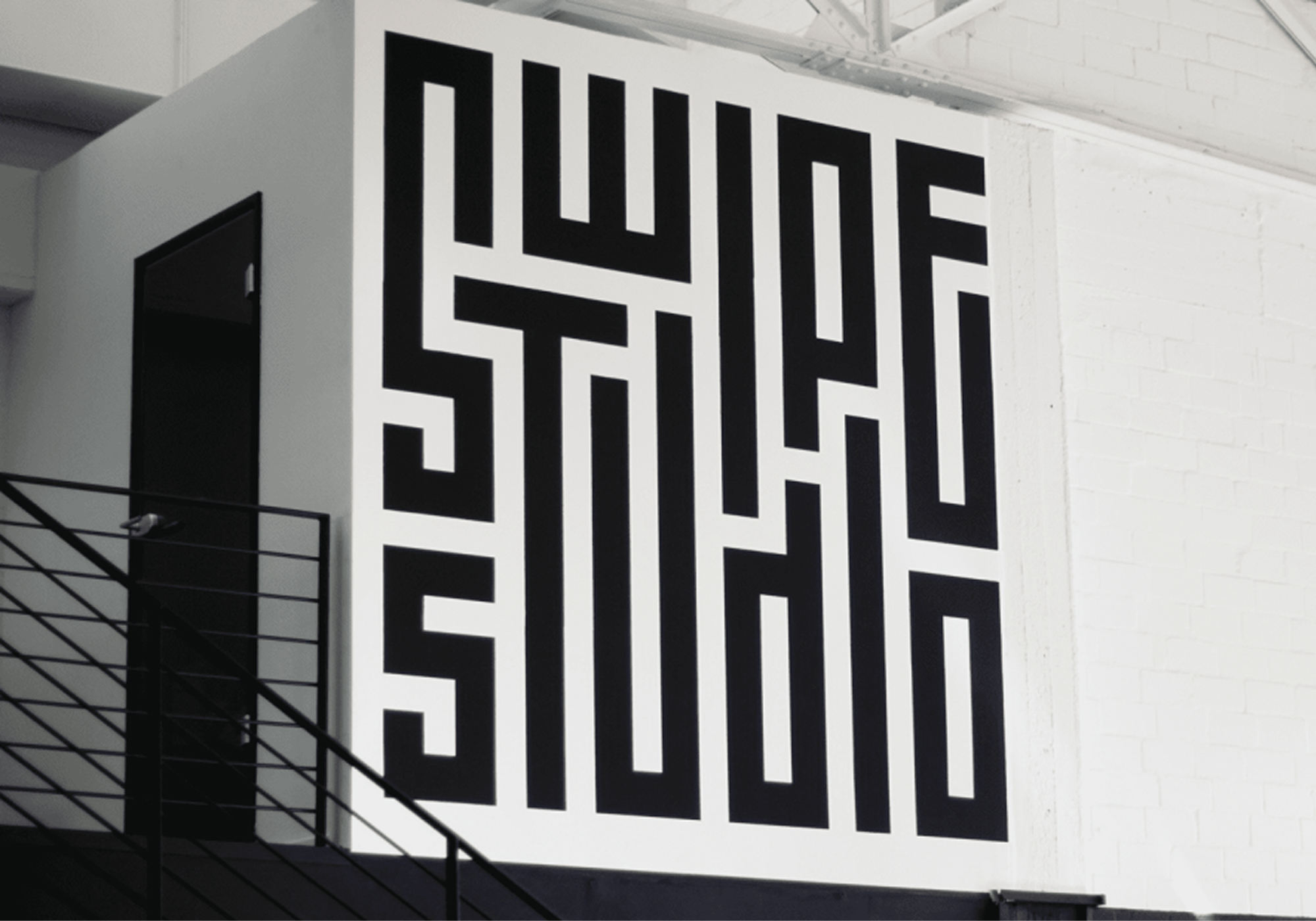 A large-scale typographic mural transforms a stairwell wall.
 An abstract mark tests balance between bold curves and open space.
 A two-page specimen records the construction rules behind a display typeface.
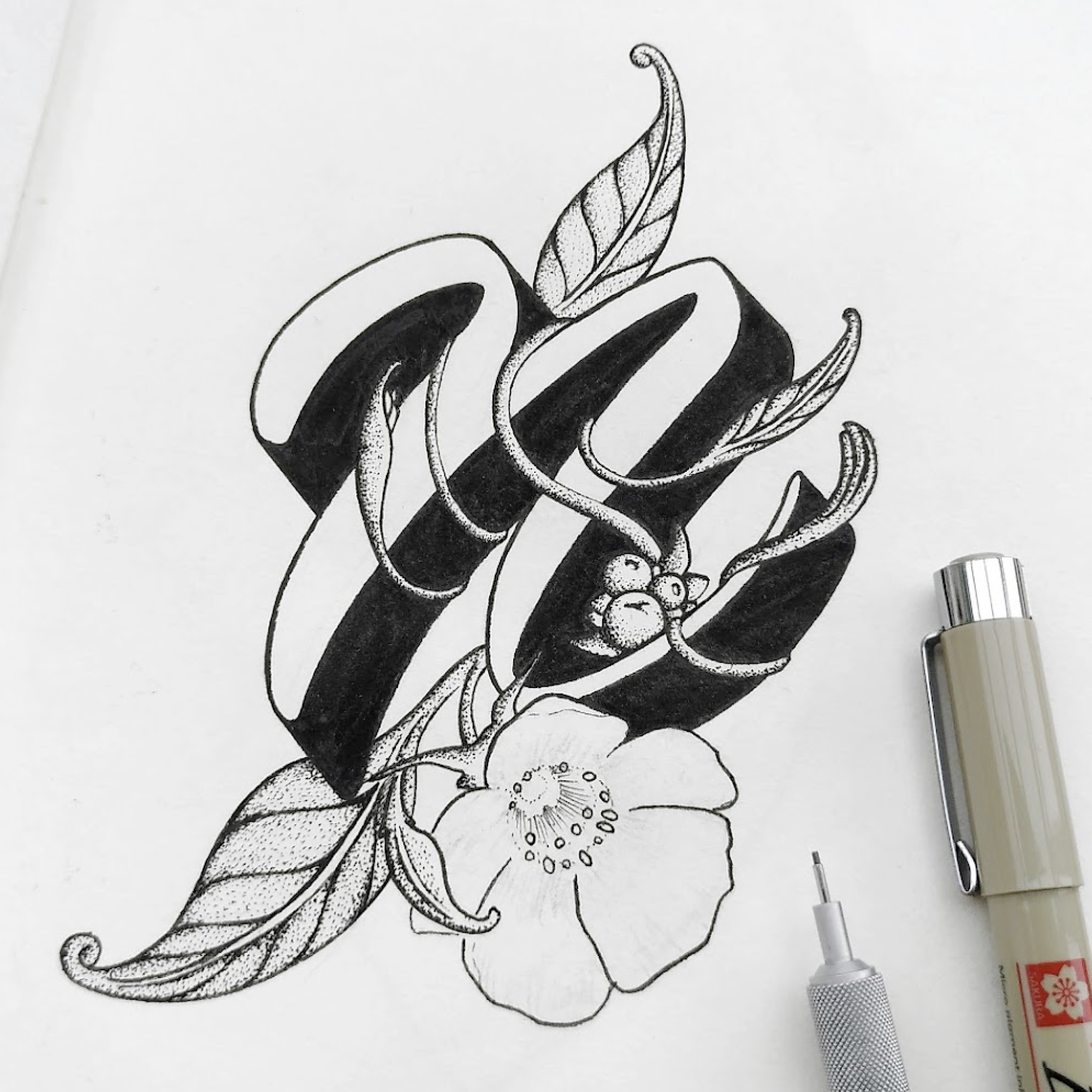
 Elegant script and botanical flourishes form a personal lettering piece.
 A high-contrast Hopsword brand study explores a compact graphic mark.
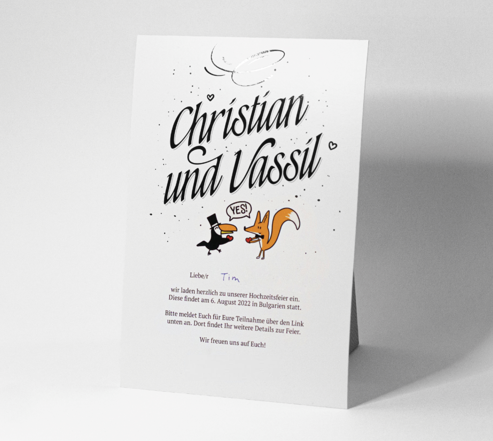
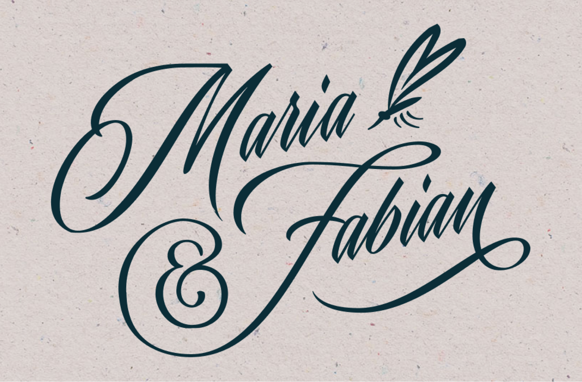 A custom script composition celebrates Maria and Fabian with a dragonfly detail.
 A playful character illustration uses angular shapes and bright lime color.
 An A6 compliment card pairs oversized type with a warm birthday greeting.
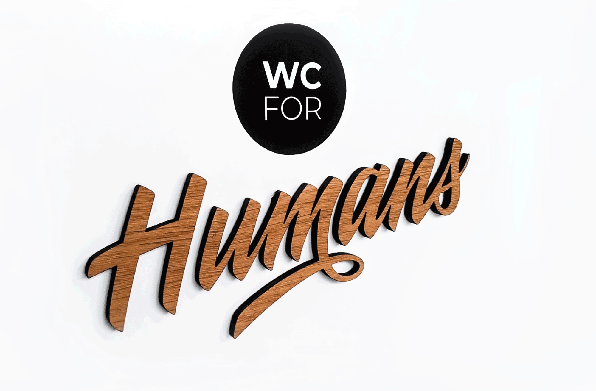 Dimensional wood lettering gives the WC for Humans sign a handmade finish.
Screen Memories variable-font experiment showing shifting letterforms.