Screen Memories
Visual Design
A component-based variable font experiment
At the base of most design systems, there is a grid. A grid can help to organize a design, structure it’s contents and give guidance by establishing a visual hirarchy – but it can also be a restriction. Especially in the early days of digitalization, low screen resolutions created clear technical boundaries on how graphics could be displayed. At the very latest with the distribution of the first personal computers using visual interfaces, a formerly niche area in design became more and more important: digital interface design. Due to rather low resolutions in early displays, designers then had to deal with the challenge of transferring formerly unrestricted design rules and patterns into very tight corset of units, the pixels, in the best way possible.
This led to a whole new aesthetic of shapes, especially for fonts – curves and other letterform details needed to be pressed in a tight, rectangular pixel grid. Thanks to the technical development of display resolutions in the last decades, designers now have more possibilities than ever to produce fine-detailed forms and display them in every way possible. But the aesthetics of pixelated fonts are still in our minds today and remind us of the early days of digital applications.
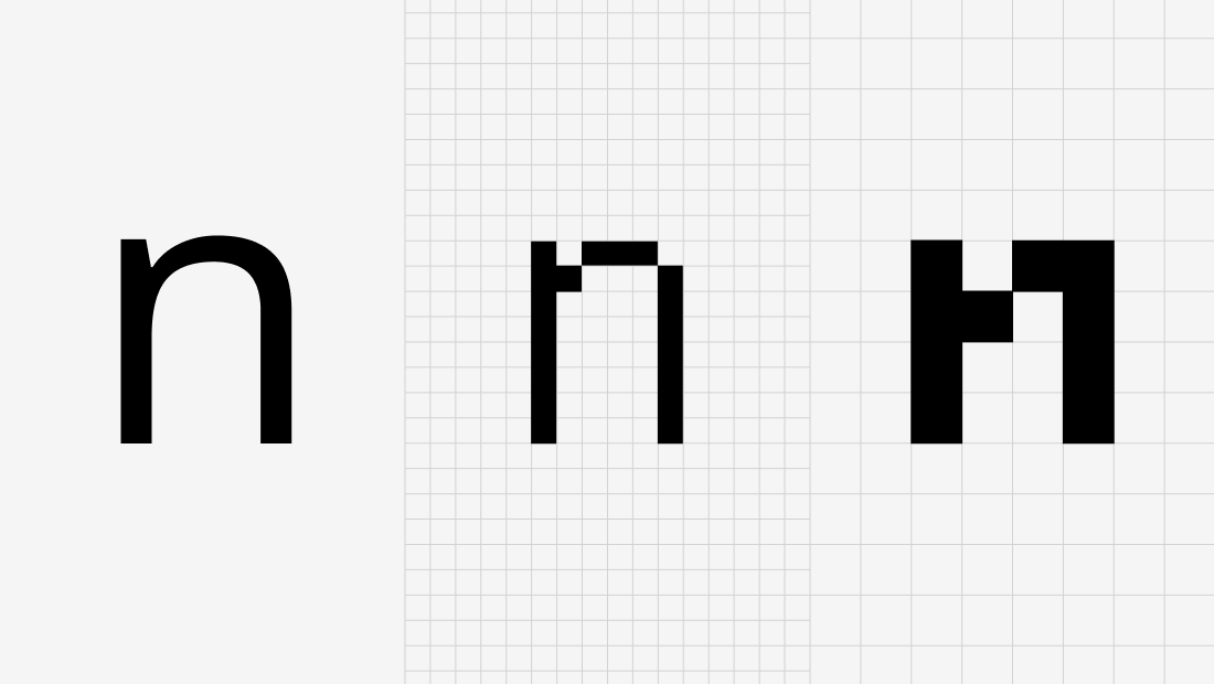 Lowercase letter N in high resolution with fine details (left) and approximations using different grids (font: Open Sans)
Designing graphics under tight restrictions like these is also interesting in the way that it forces us to reduce forms to their necessary essence, so that we can still recognise them. So in a way, early digital fonts were also unavoidably minimalistic.
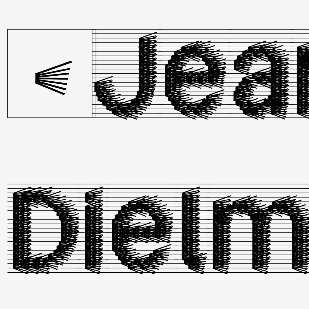
Another development in the technology of digital fonts in the last years is the concept of variable fonts. Variable means that forms can be gradually transformed from one variant to another – and every possible step in between can be displayed as well.
With this feature, variable fonts open up a great range of possibilities in design.
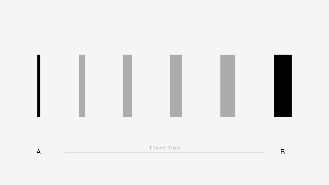 Principle of variable fonts: the complete range between two designed states of a form (A and B) can be computed
The idea: combining the old and the new
While studying the possibilities of variable fonts and the history of early digital fonts, the idea of combining aspects of both of them formed: the flexibility of variable fonts in interplay with the restrictions of early pixel fonts.
This article illustrates the outcome of my experiments about creating a digital font that combines a restricted grid together with flexible, variable units (components).
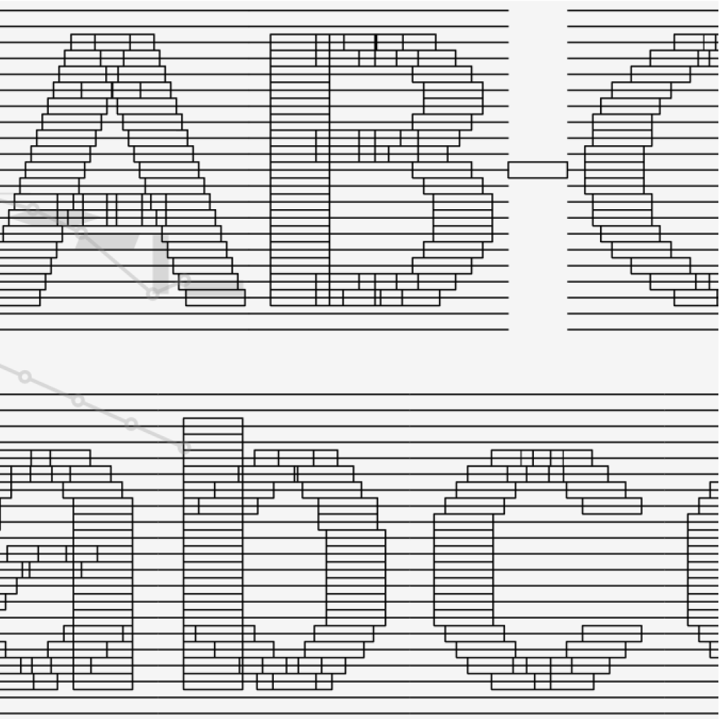
Before going into the experiments, let me shortly introduce the thoughts behind the construction of the letters. The letters are constructed in a grid of rows. The basic style is a regular sans serif. A special feature of the font is the extreme high x-height, the low space for ascenders and the completely missing space for descenders (meaning the descenders are fit inside of the x-height space. This underlines the restriction of fitting letters in a very small space and at the same times allows for the font to be used with a very narrow line height.
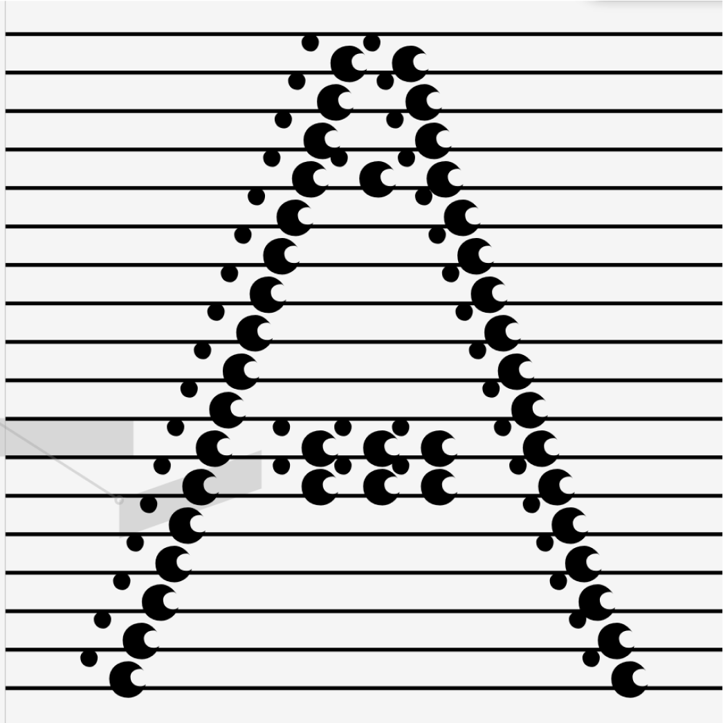
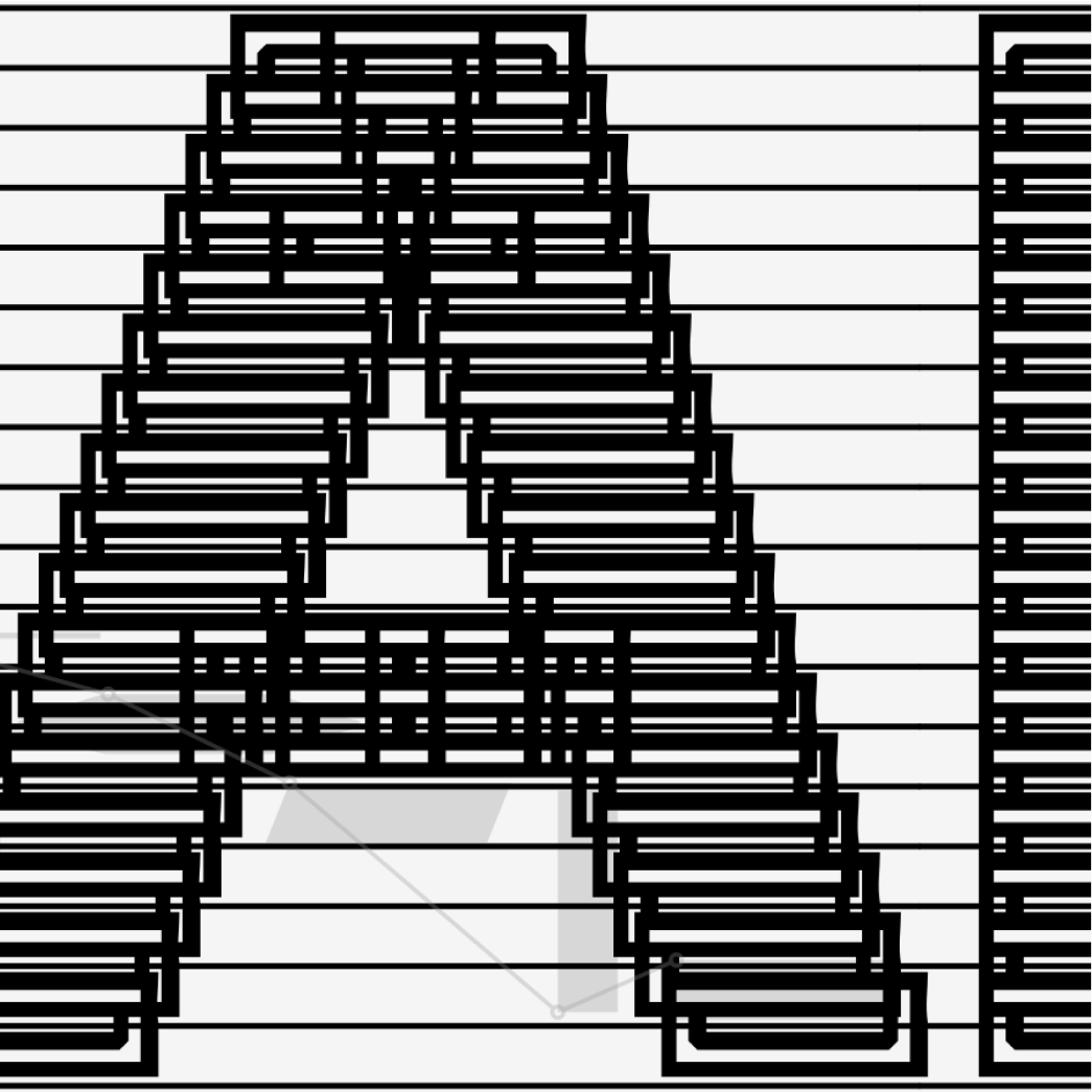
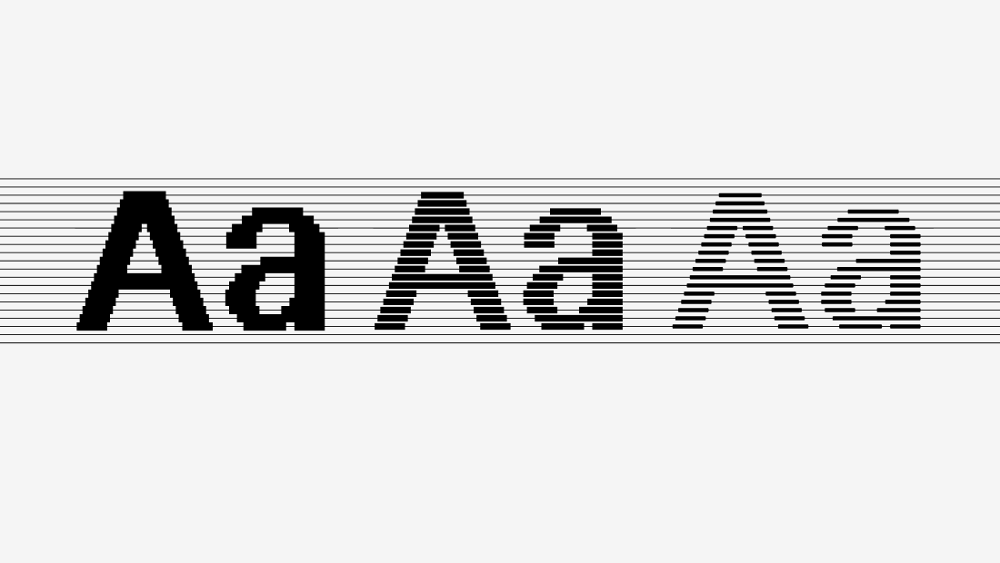 Weight variations of the letter A. You can see how the components align to the grid
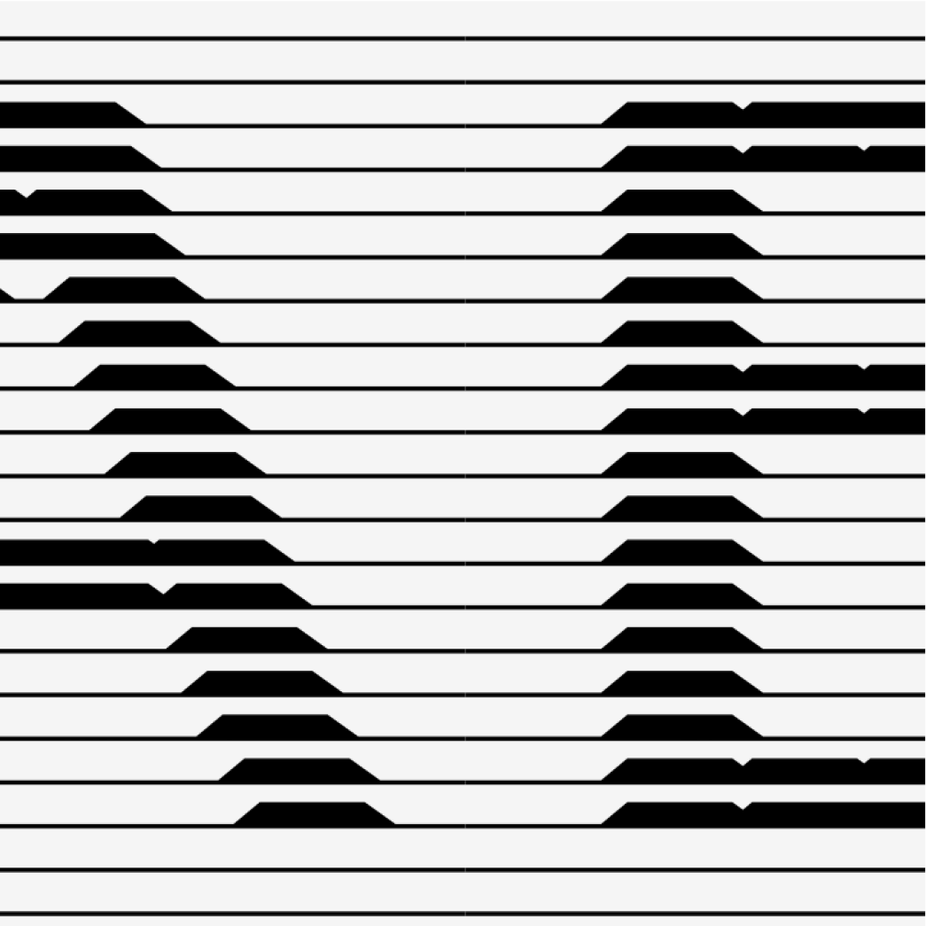
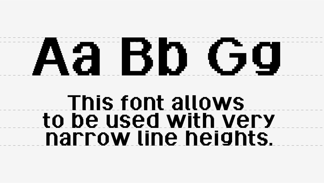 The extreme x-height and the absence of ascenders allows the font to be set with very low line-heights
Introducing variable components
There are four axes in this variable font that can each be manipulated seperately. Every axis affects the base component of the letters differently, as demonstrated below:
The adjustment of the basic component in different axes allows for the letters to change its properties and appearance completely. We can not only change one axis and one property at a time, but iterate between different axes and let the application calculate all possible versions in between, which leads to some interesting results.
Letterform construction
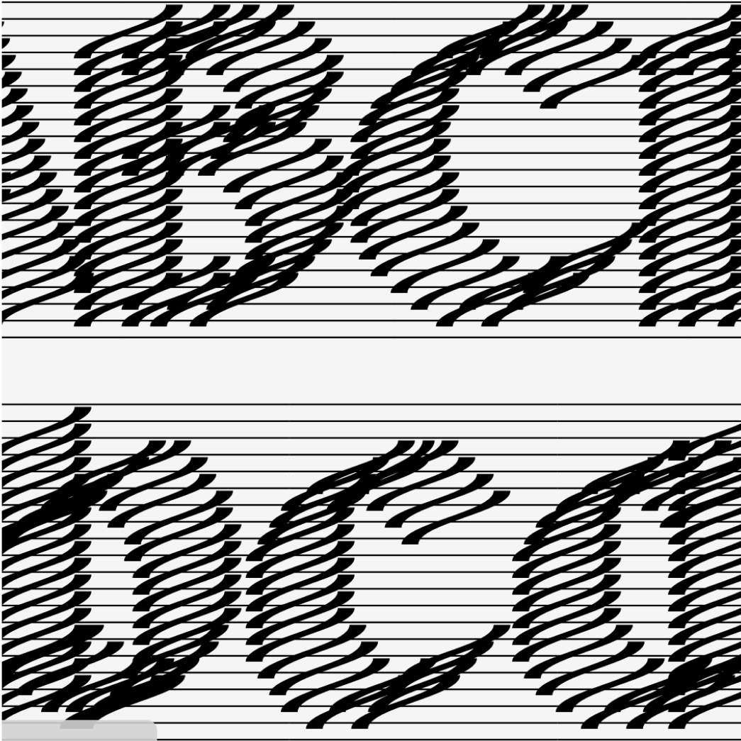
The letterforms themselves are entirely constructed of the base components shown above. A change in the base components leads to a change of the whole letter. Aditionally to the change in the base component itself, the arrangement that makes up the letter can be adjusted, in this case for creating an italic version with the Slant Axis.
Hover over the letters to see how each axis affects the look of the letter.
Weight
^ AForm
^ ASlant
^ AComponent Angle
^ ACharacter Set
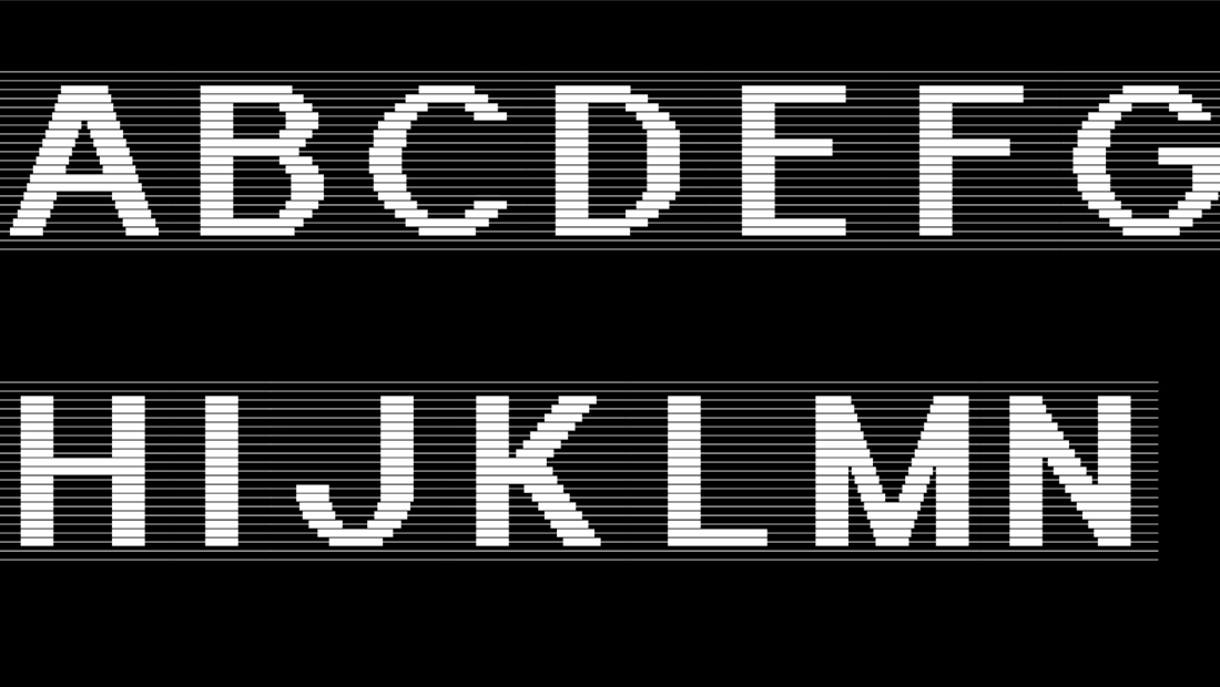
The font includes all uppercase and lowercase letters, the numbers and basic interpunctuation.
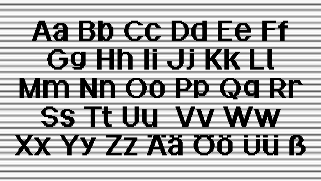 Upper- and lowercase alphabet
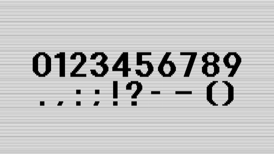 Numbers and basic punctuation
Manipulating the axes
The basic principle is clear – a manipulation of the base component changes the apperance of the letter. Now, we can change the properties of the font and mix between the axes to our liking.
Use the editor below to adjust the axes of the font. You can also enter your own text!
Hello
Interchanging the base component
We’ve seen now how smaller adjustments of the base component change the appearance of letters. But we can even go beyond smaller adjustments in the form and interchange the base component more radically. Choose a form below to see how it alters the letterforms and what interesting coincidences appear through that.
All in all, it’s very interesting to see how much is possible within a restricted grid and frame and to how many interesting results an exploration like this can lead. Below, you can find more screenshots of the design process and component alternatives as well as coincidences that happened along the way.
I hope you enjoyed this exploration. I designed this font as a part of the type design course "Screen Memories" under the guidance of Prof. Pierre-Pane-Farré, summer semester 2022, HAW Hamburg.
Thanks for reading! 😊